The Culture Quarter - Flexible brand & type system
Savannah’s Culture Quarter, the city’s new entertainment district, needed an identity that could connect with its wide audience of students, tourists, and longtime residents without losing its historic character. I created a flexible brand and type system that adapts effortlessly across diverse audiences, events, and media.
My role:
Graphic Designer
Collaborators:
Thomas Hull
What I did:
Bespoke typeface
Brand identity
Motion design
My role:
Graphic Designer
Collaborators:
Thomas Hull
What I did:
Bespoke typeface
Brand identity
Motion design

Urban Planning Inspired Type
I customized the open-source typeface Raleway, allowing it to stretch, echoing Oglethorpe’s grid of public squares where each letter has the potential to frame photos and create playful layouts.
Brand Elements
A palette of soft pastels and vintage-style image treatments celebrates Savannah’s charm, while a range of logo versions—from bold wordmarks to subtle glyphs—fits every occasion.


Wandr.
Wandr. makes road trips more spontaneous, exciting, and memorable.
My role:
UX/UI Designer
Collaborators:
Chi Quach
Madeline Bay
What we did:
Design system
Prototype
User research & testing
Iconography
Brand identity
My role:
UX/UI Designer
Collaborators:
Chi Quach
Madeline Bay
What we did:
Design system
Prototype
User research & testing
Iconography
Brand identity

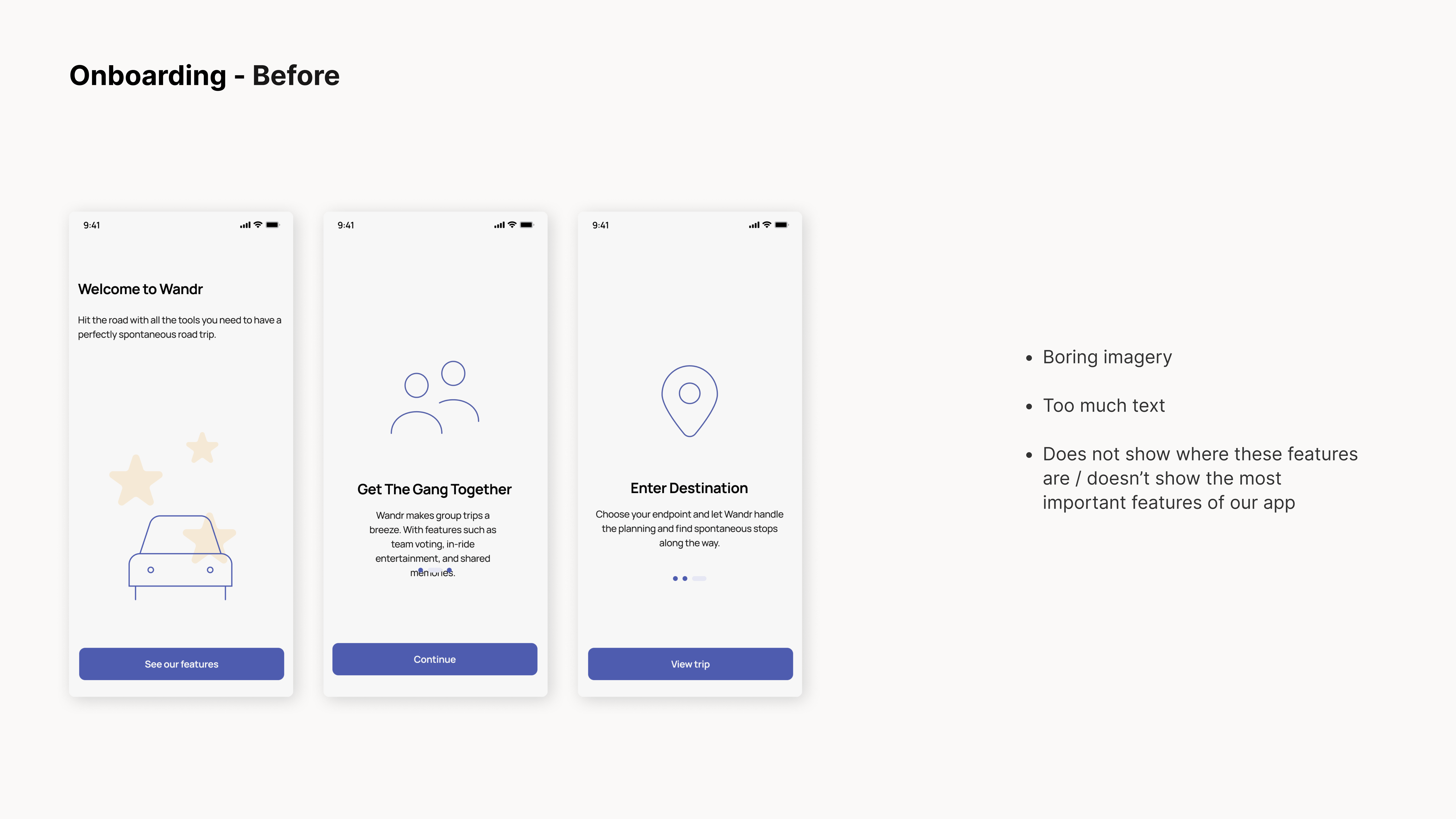
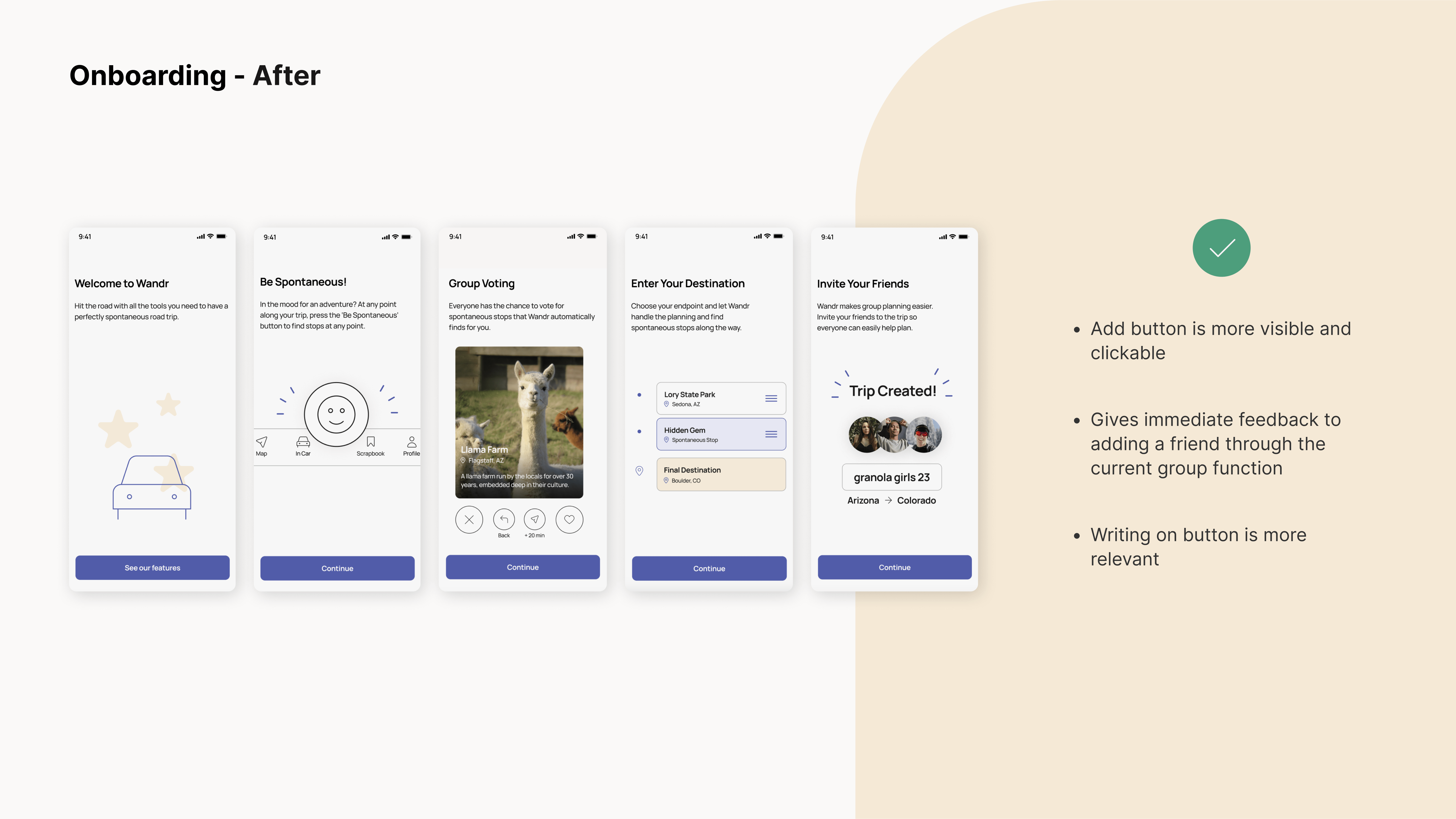
Problem
The best part of a road trip is discovering unexpected, local roadside attractions. While most travel apps focus on logistics—like gas station prices and traffic—they overlook the emotional side of the journey, often making trips efficient but forgettable.
HMW Statement
How might we enhance the emotional experience of road trips by creating spontaneity?
Solution
An app that finds nearby roadside attractions, lets groups vote on stops, and fosters connection through in-car games and shared memory collections.

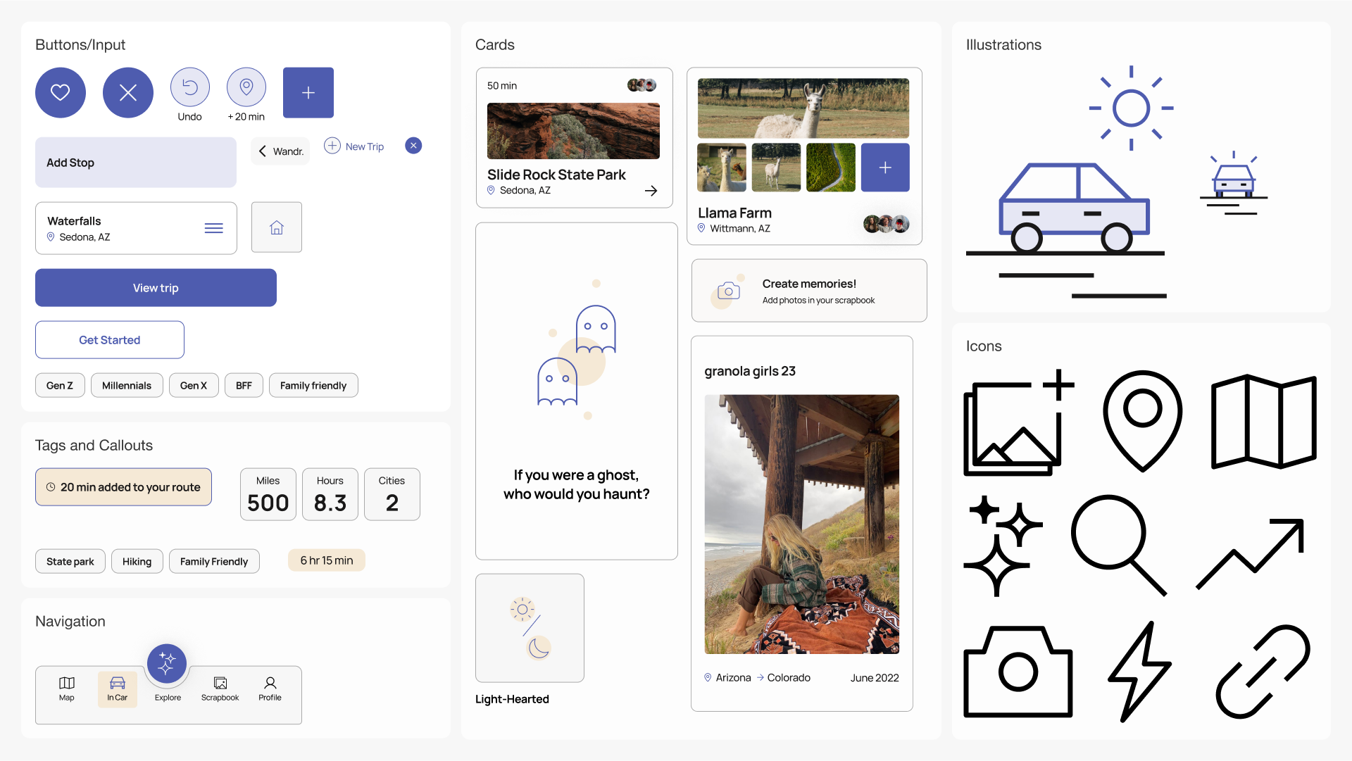
Design System
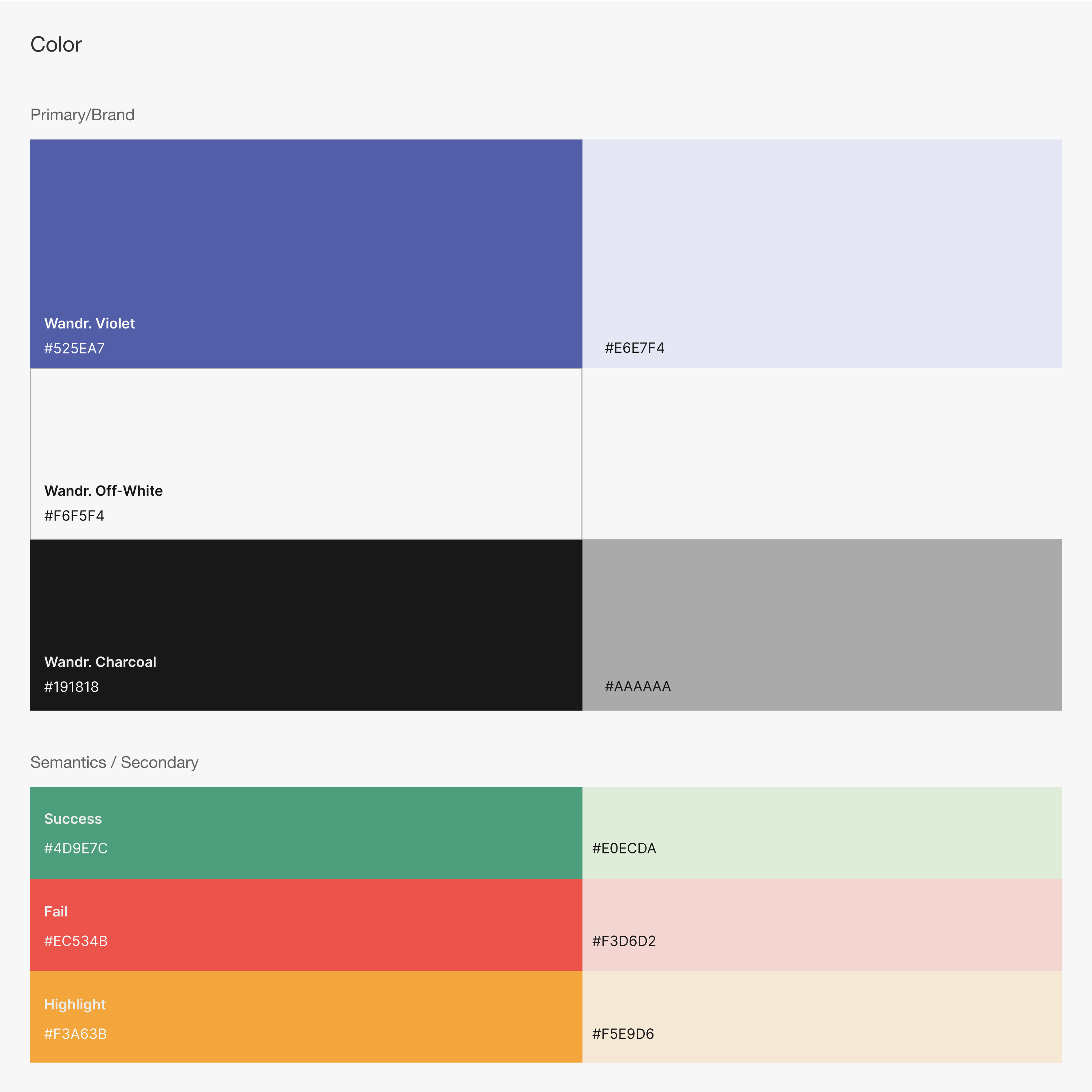
Audience segmentation revealed a strong preference for visual clarity and ease of use, which guided a system built around generous negative space, clear hierarchy, and accessibility.


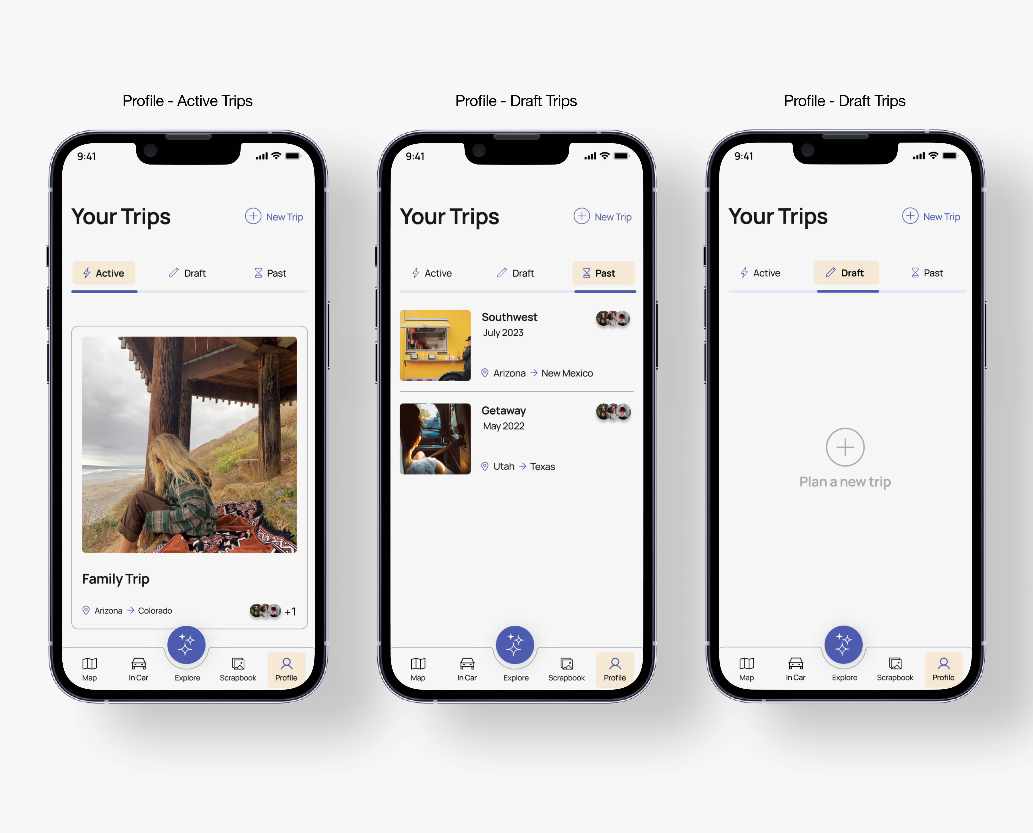

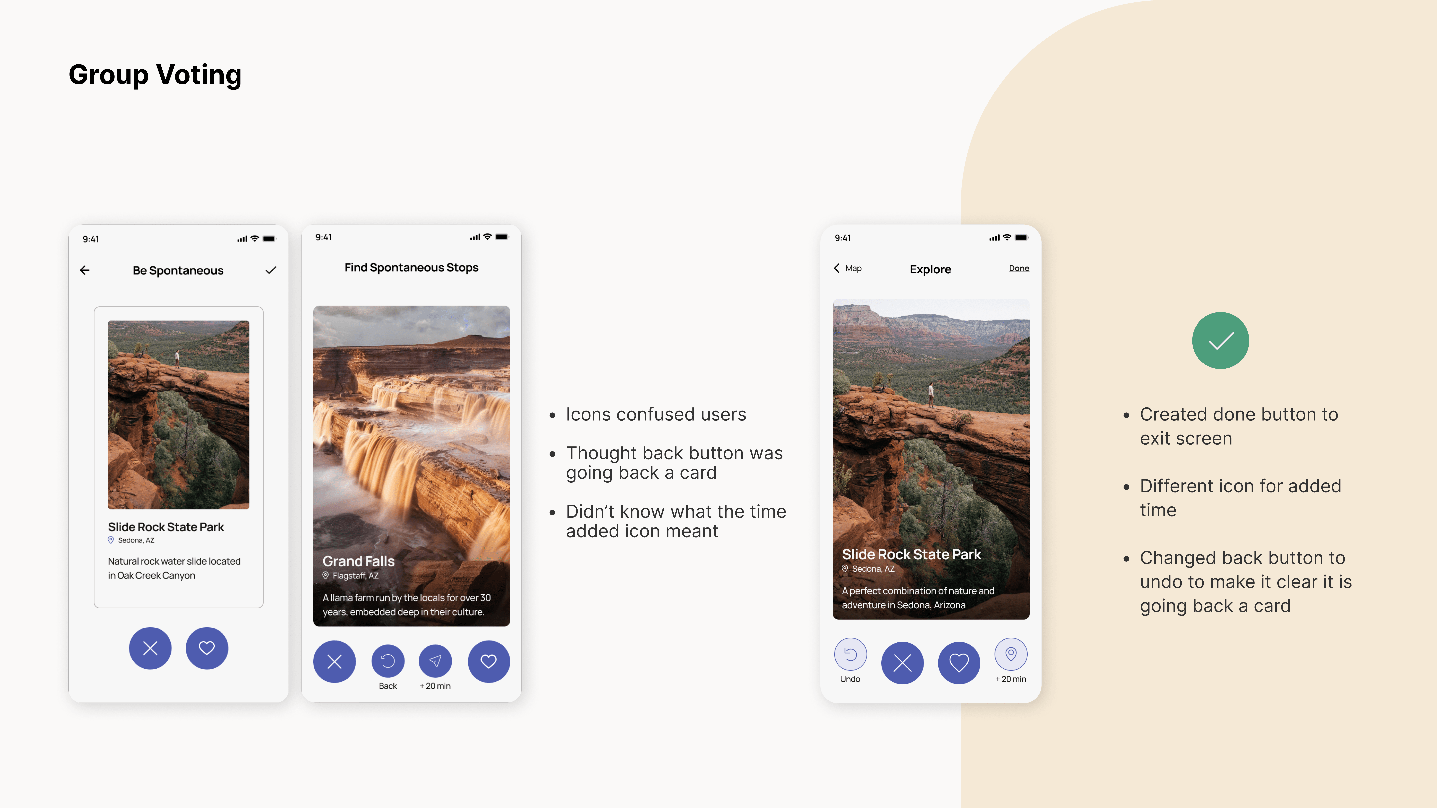
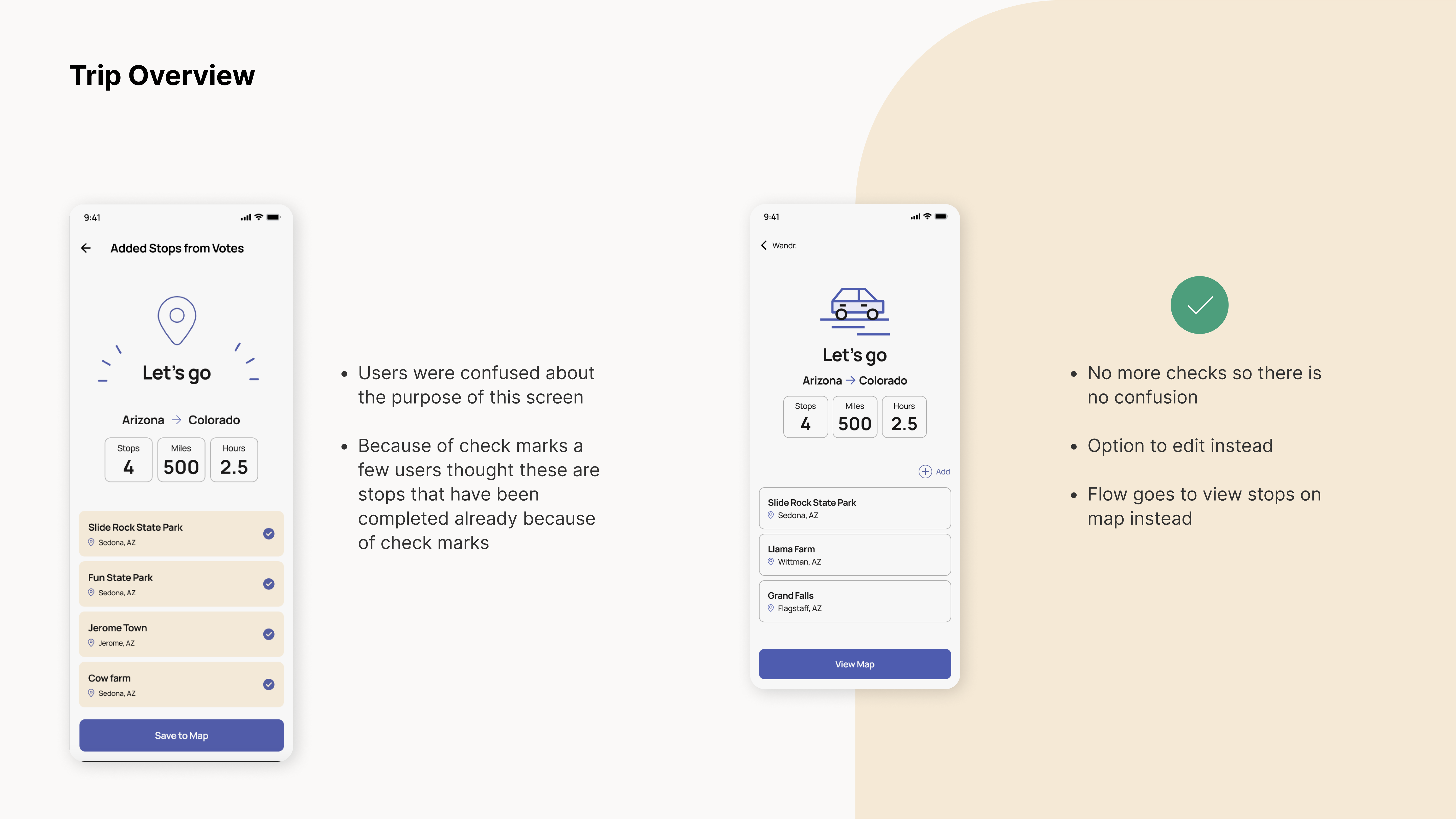
Key Screens and Flows
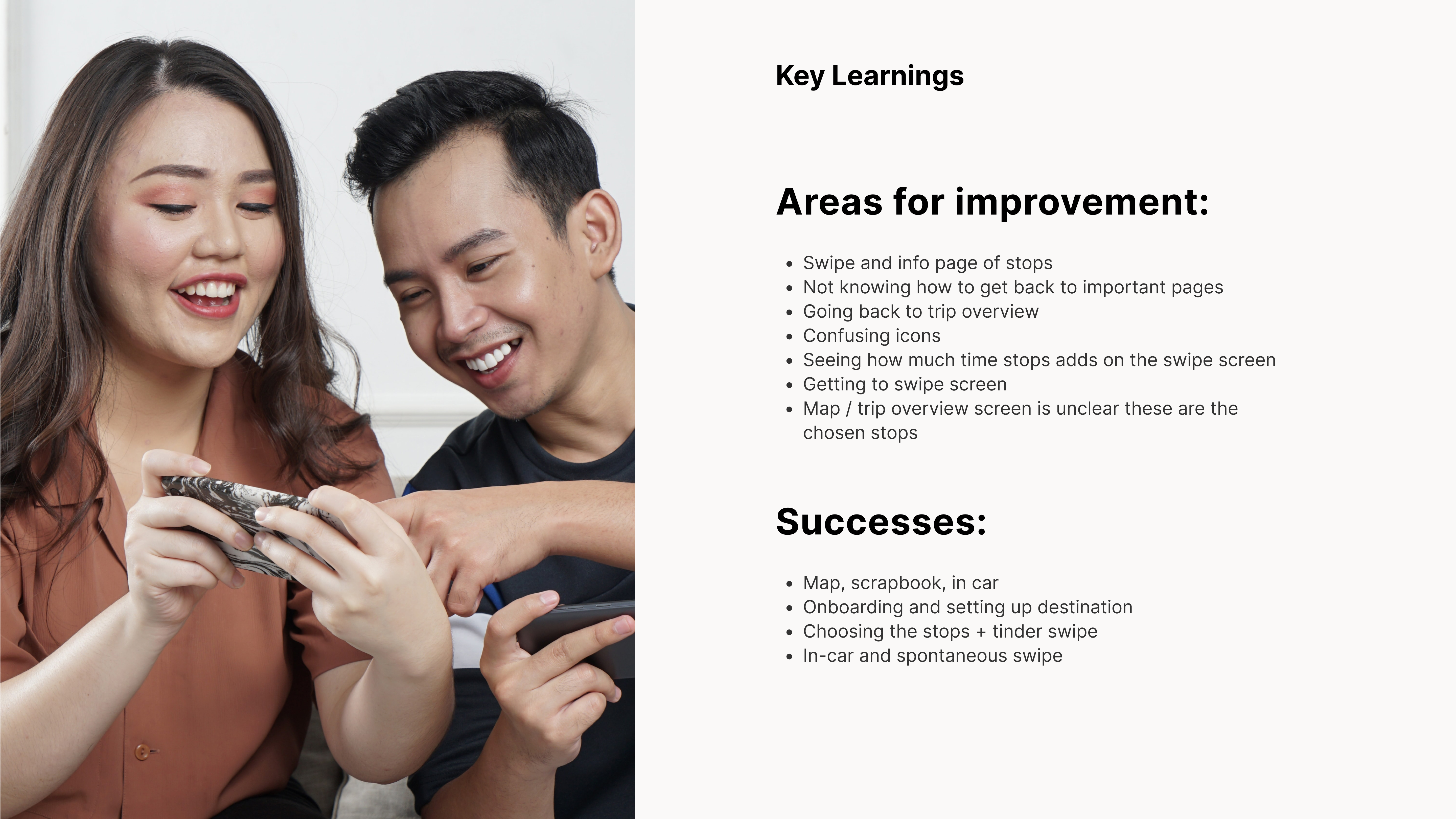
We designed a high-fidelity prototype in Figma, and used After Effects to imagine how motion can to amplify those key moments.


Accessible Design
Our design system was crafted to meet accessibility standards, ensuring inclusivity.
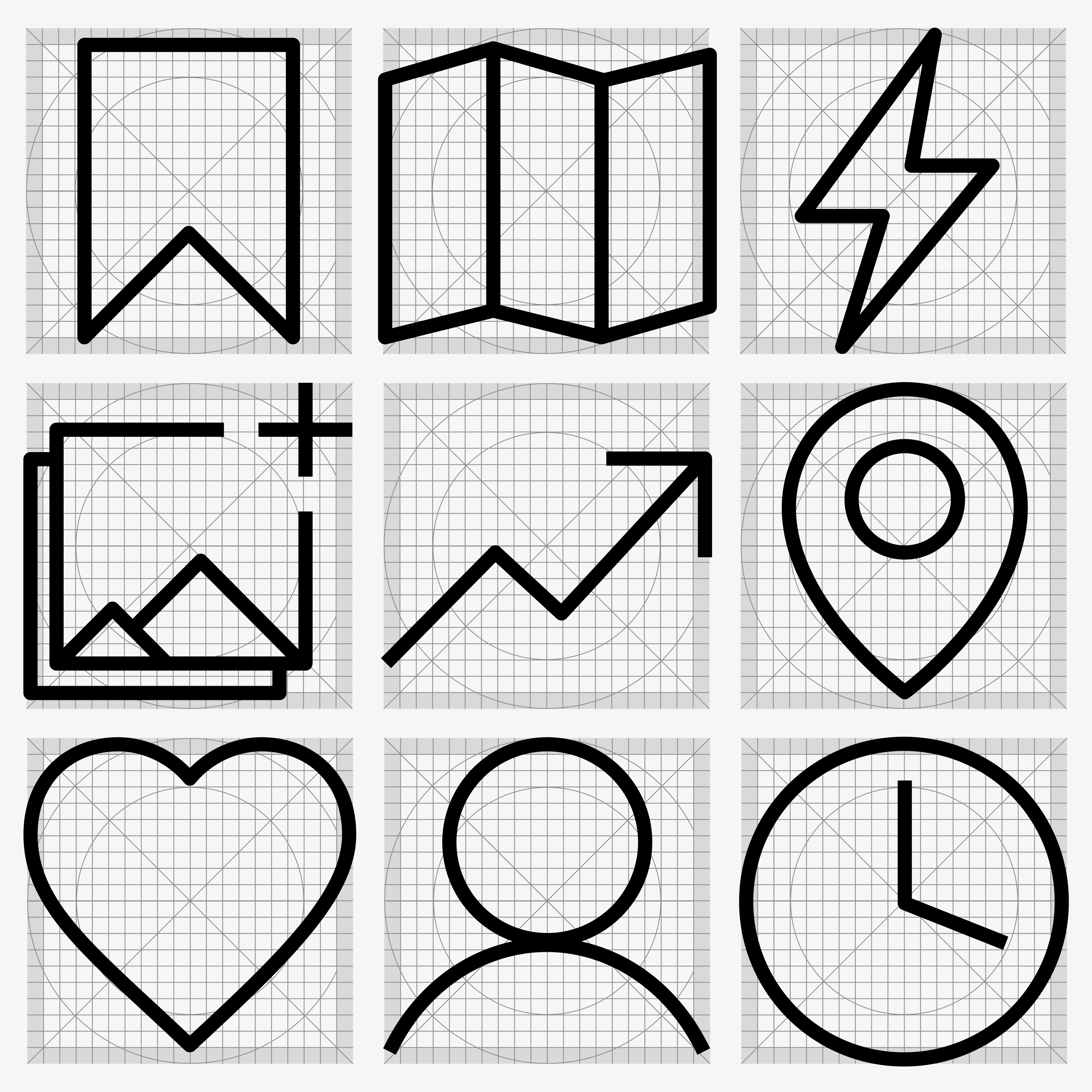
Custom Icon Suite
I designed a bespoke set of icons that bring cohesion and character to the design.


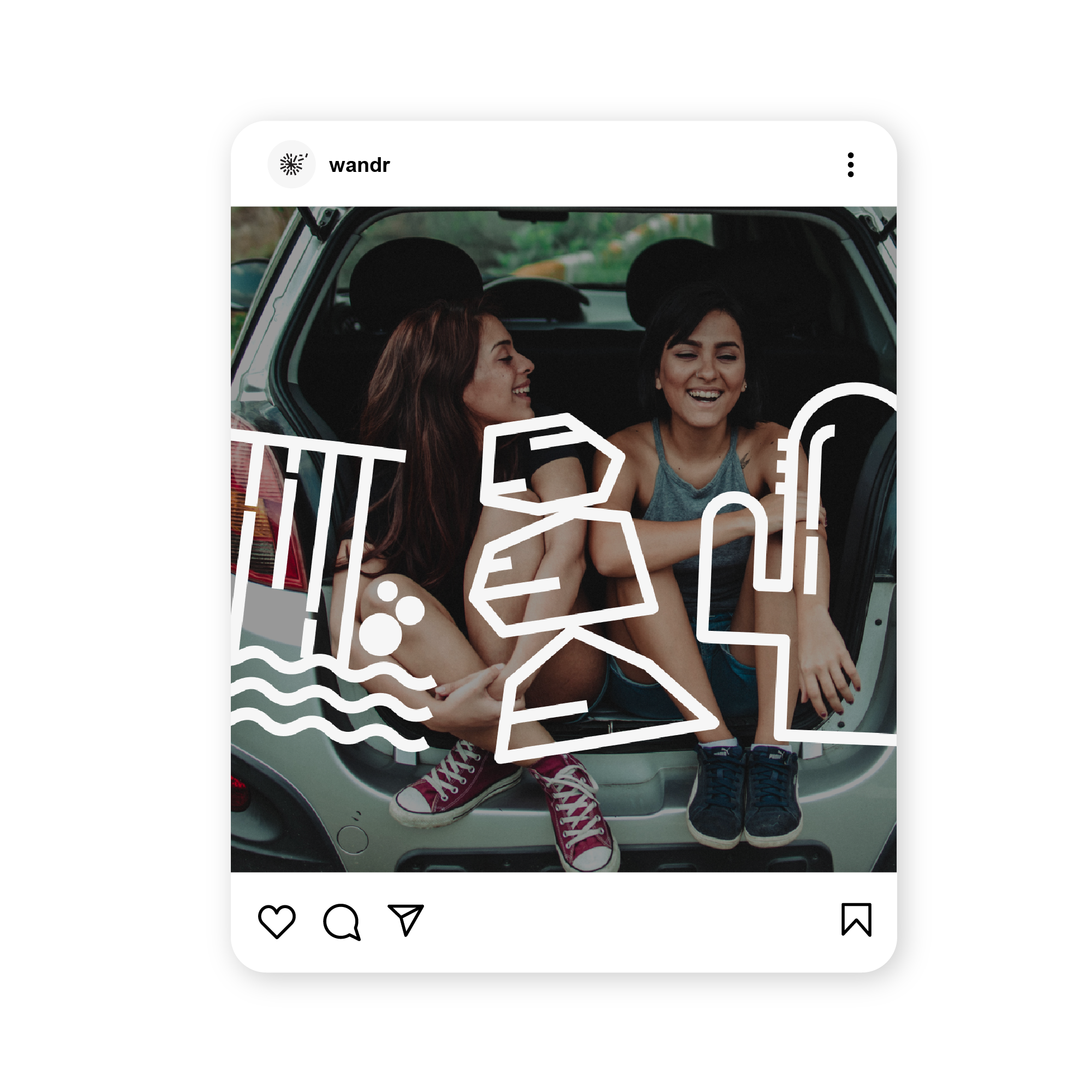
Brand Expression
To express the spirit of road travel, we designed playful UI elements and destination-specific visuals that connect tangible features to intangible moments—like camaraderie, culture, and discovery
 Main insight 1:
“50-foot junkyard sculptures”
People love road trips for their spontaneous, unplanned stops.

Main insight 2:
“The driving part sucks”
Our interviewees despised the boredom that is involved during those extended driving times.
 Main insight 3:
“Visual & easy to use”
Our target audience prefers visual formats, functionality, and easy navigation.
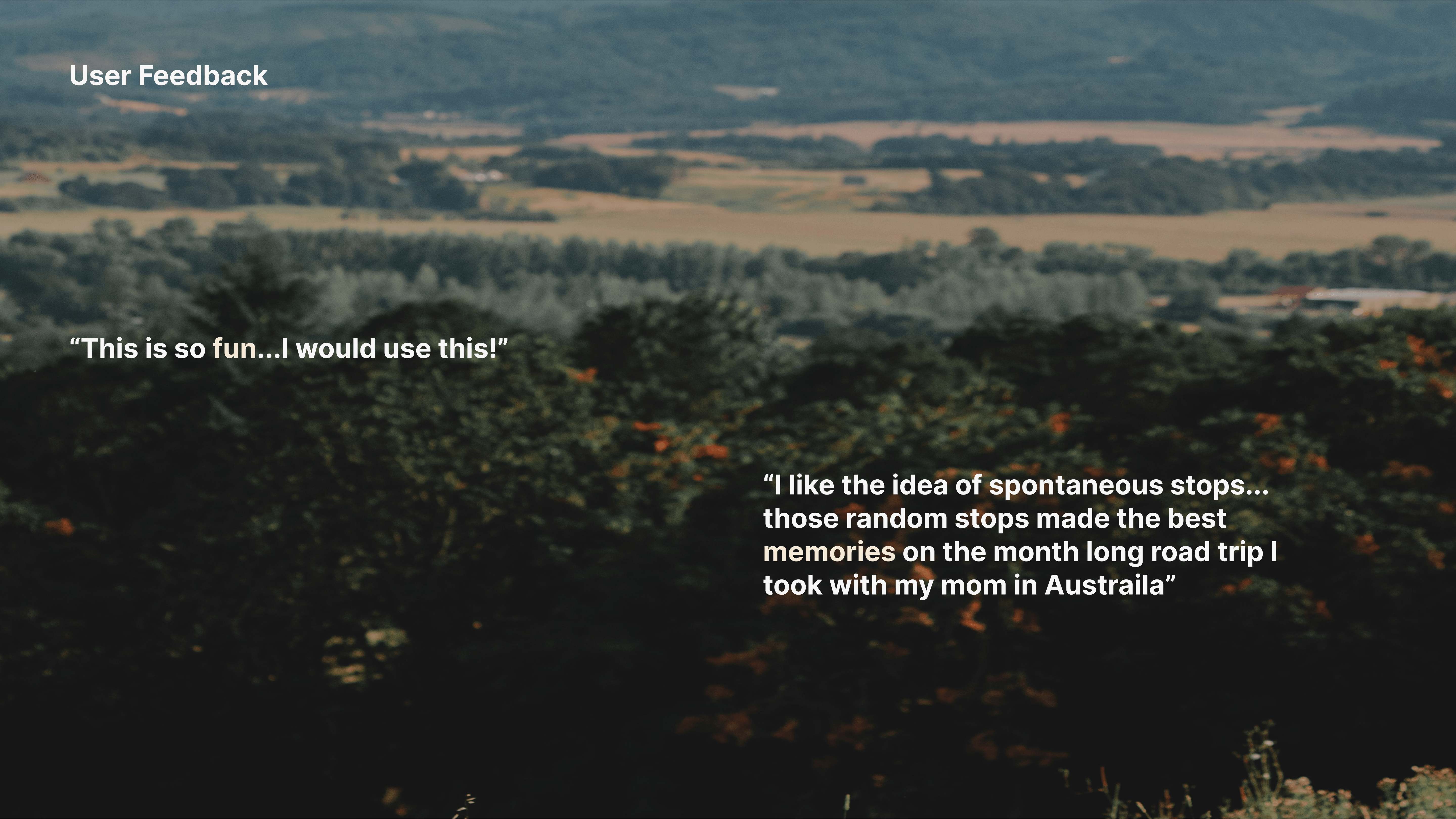
Gathering Insights
We grounded our concepts in six user interviews, segmentation research, and journey mapping—informing everything from layout to feature ideation.


#bravehood — Motion that humanizes
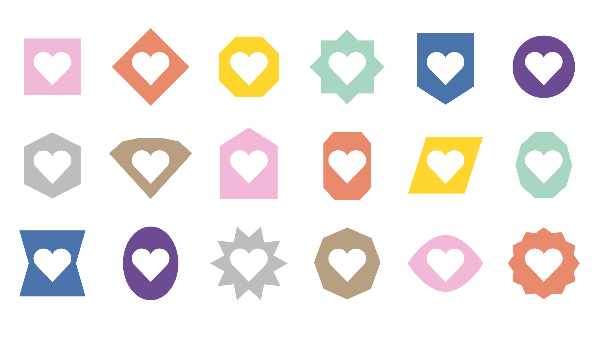
Szenario Design developed the visual identity for #bravehood, a charity campaign supporting children in Ukraine through merchandise featuring donated lyrics from global musicians. I was brought in to create a motion system that extended the brand across digital platforms, amplifying its message of individuality and collective support through movement.
My role:
Motion Designer
Collaborators:
Erich Bendl, Szenario Design
What I did:
Motion design
My role:
Motion Designer
Collaborators:
Erich Bendl, Szenario Design
What I did:
Motion design
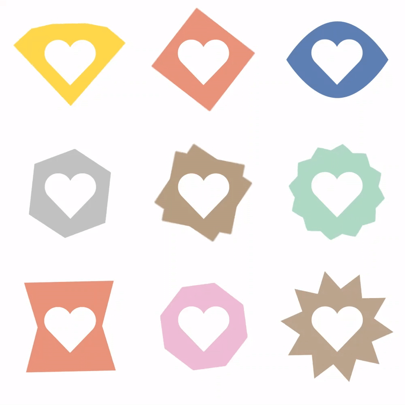
Celebrating Individuality
Each heart icon was animated with a unique motion shaped by its form—round, sharp, simple, or abstract—celebrating expressive individuality.
Collective Movement
To reflect a sense of unity, I created a cascading sequence where one heart begins moving and the others gradually follow, evoking the spark of collective action.
Dancing Colors
A looping color-swap rhythm added subtle motion and reinforced the campaign’s musical roots.
Process
I explored motion behaviors rooted in rhythm and form, creating animations that felt natural and alive across the icon system.