StrategyOS
A platform for strategy at scale
Collaborating with a Fortune 500 car company to build, from 0-1, an internal platform for brand strategy.


PROJECT OVERVIEW
A scattered strategy.
The global strategy team at a Fortune 500 car company spent over a year developing a brand strategy for a new luxury brand. The result was extensive research, but it lived across disconnected decks, documents, and teams.
The fragmentation made it hard to find insights, align across functions, and scale the work as the brand grew. They needed a system that made research easy to access, simple to understand, and built for collaboration under rapid growth.
Making strategy accessible and scalable.
We built a streamlined internal database from the ground up, transforming scattered research into a single, easy-to-use hub. The platform organizes and beautifully displays content from global research and strategy teams, making insights clear, accessible, and ready to grow with the brand.
We built a streamlined internal database from the ground up, transforming scattered research into a single, easy-to-use hub. The platform organizes and beautifully displays content from global research and strategy teams, making insights clear, accessible, and ready to grow with the brand.
OUR APPROACH
Quickly shaping a product strategy.
With no time or scope for user research, we ran a stakeholder workshop to explore different interaction metaphors and present early wireframes and prototypes, helping facilitate conversations about problems their team faced, and what sort of experience they were looking for.
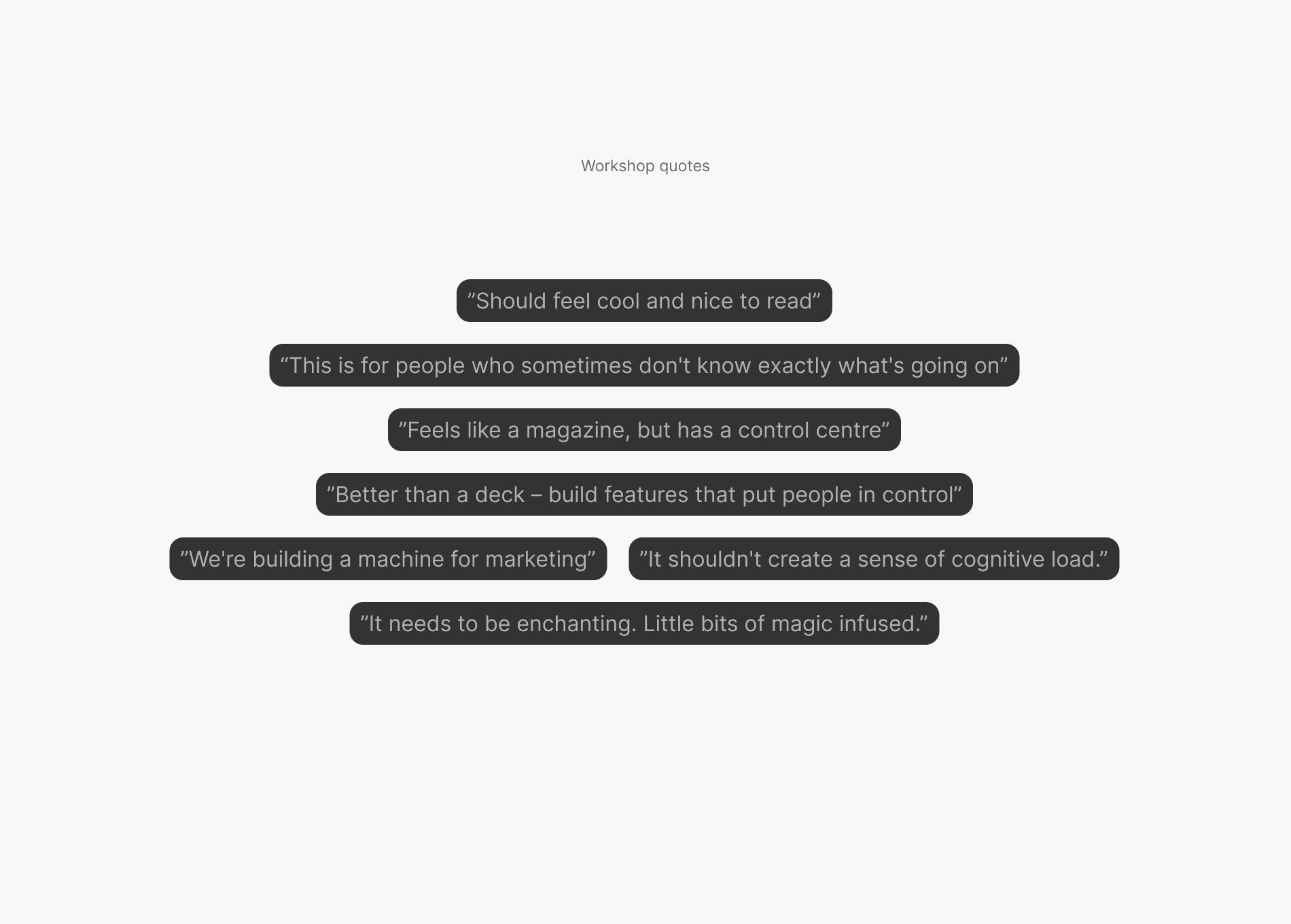
From the workshop results, we narrowed our focus on two key aspects that our solution must include:
PRODUCT FOCUS 1
Reduce cognitive load.
Reduce cognitive load.
Design the content, interactions, and navigation so it’s easy to understand, explore, and engage with.
PRODUCT FOCUS 2
Empower clean and effecient scaling.
Empower clean and effecient scaling.
Brand strategy evolves quickly. Create a flexible yet robust system architecture that can adapt to a rapid growth of content.
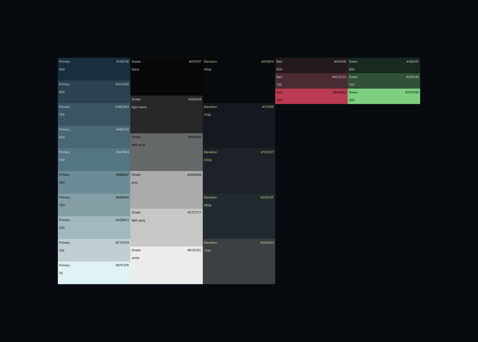
THE DESIGN SYSTEM
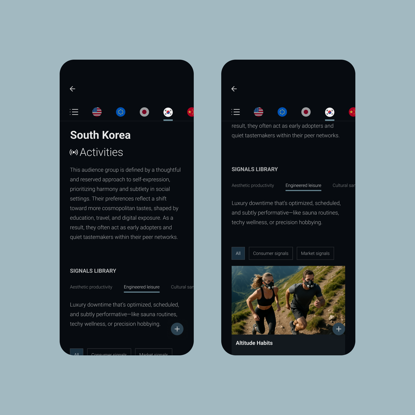
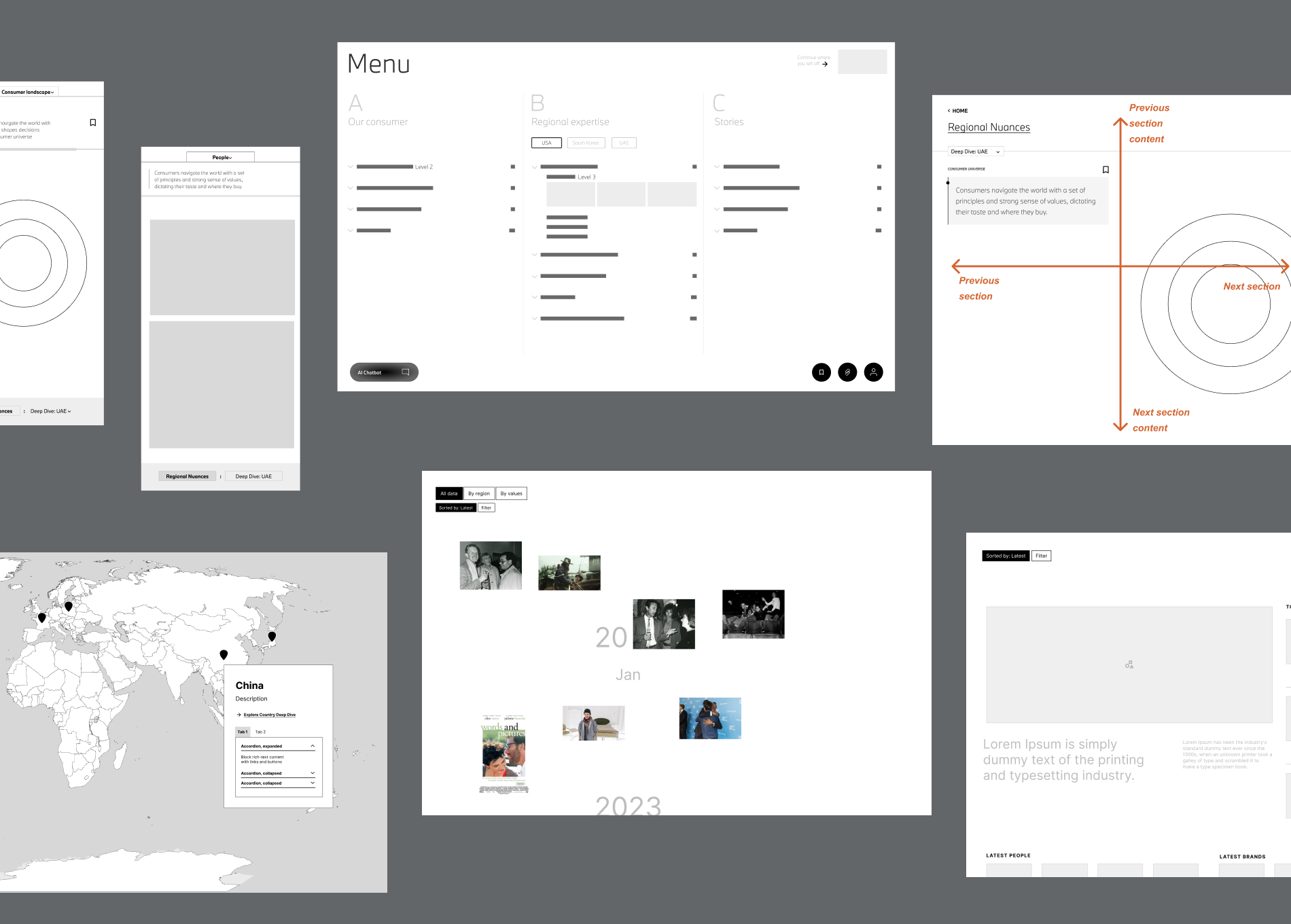
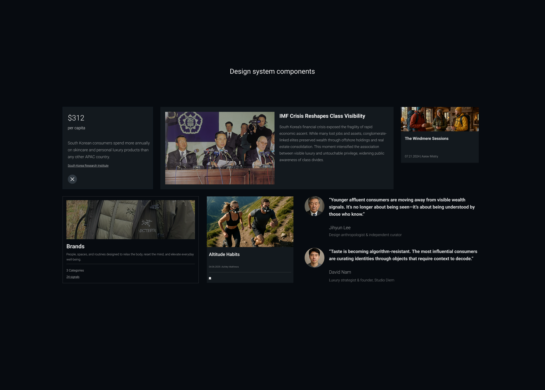
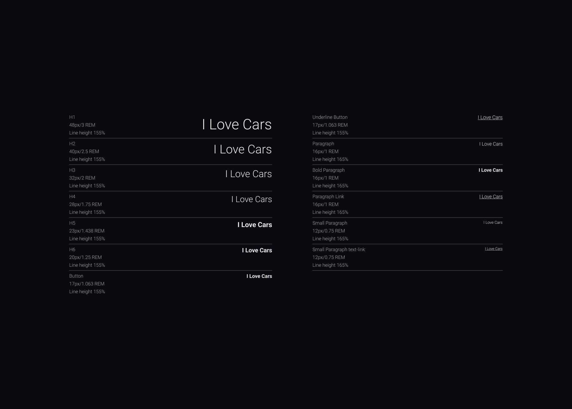
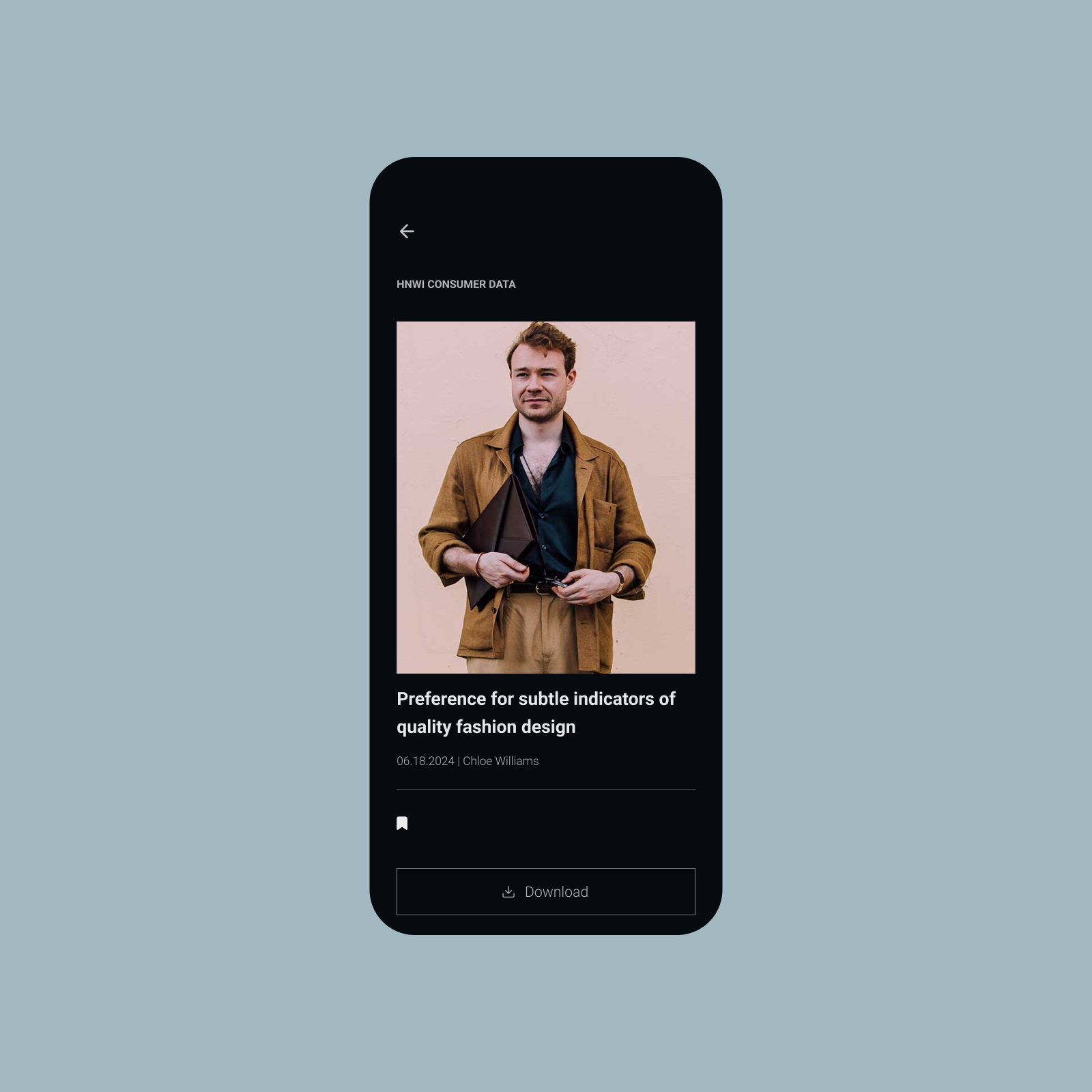
A design system for clarity and understanding.
Working closely with the strategists and researchers, we built a modular design system with interactive frameworks tailored to the team’s mental models. The system transformed raw data from six global regions into a clear, visually engaging experience.
We emphasized strong text hierarchy and generous use of imagery to keep content accessible, easy to scan, and enjoyable to explore.
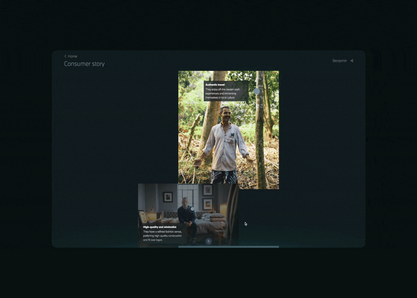
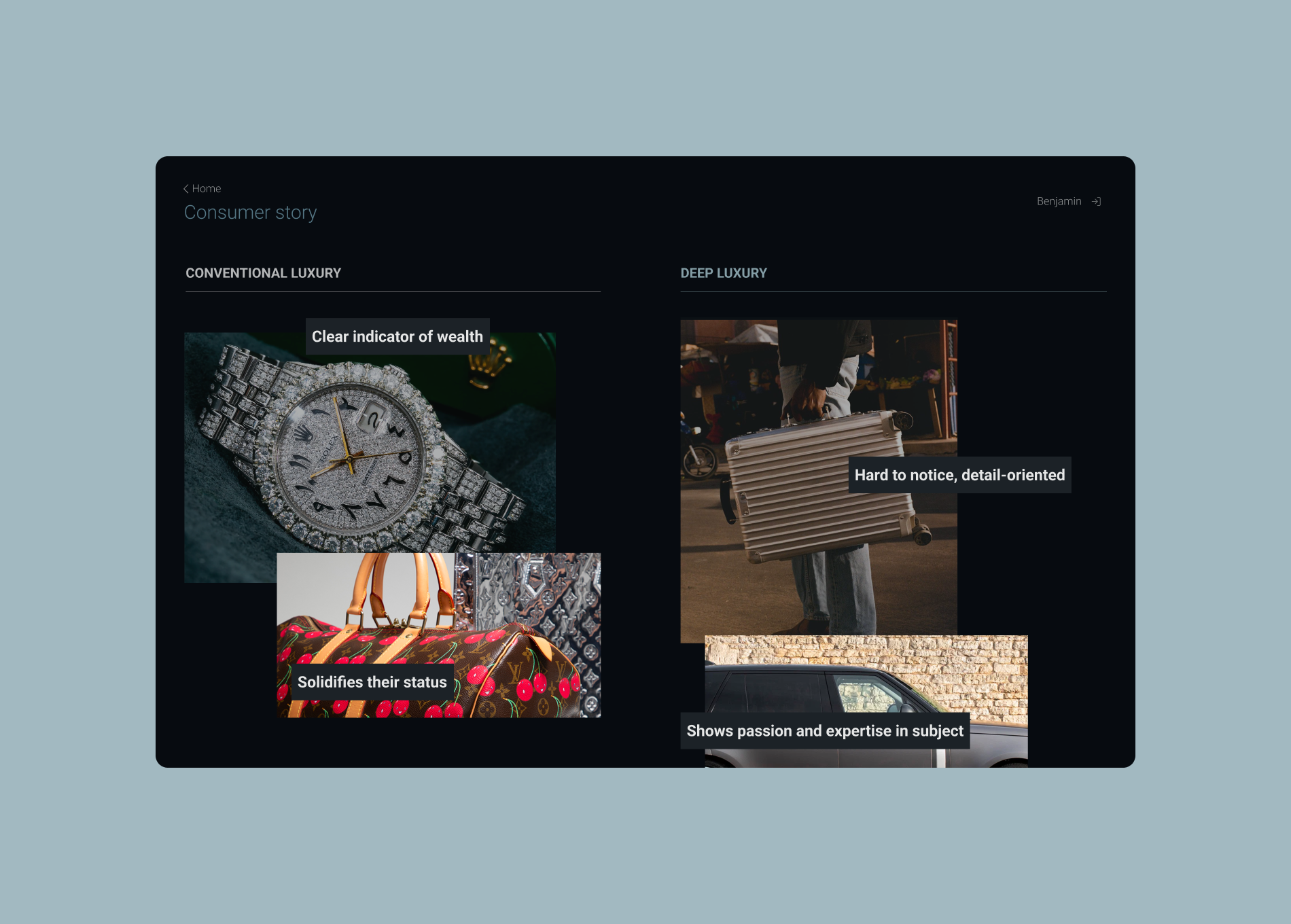
INTERACTION DESIGN
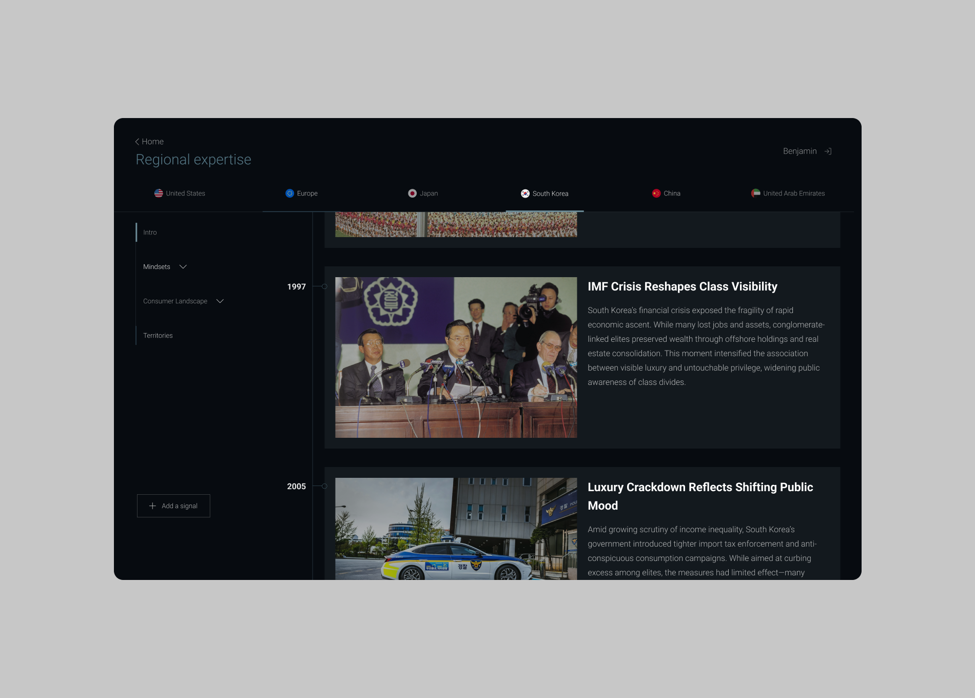
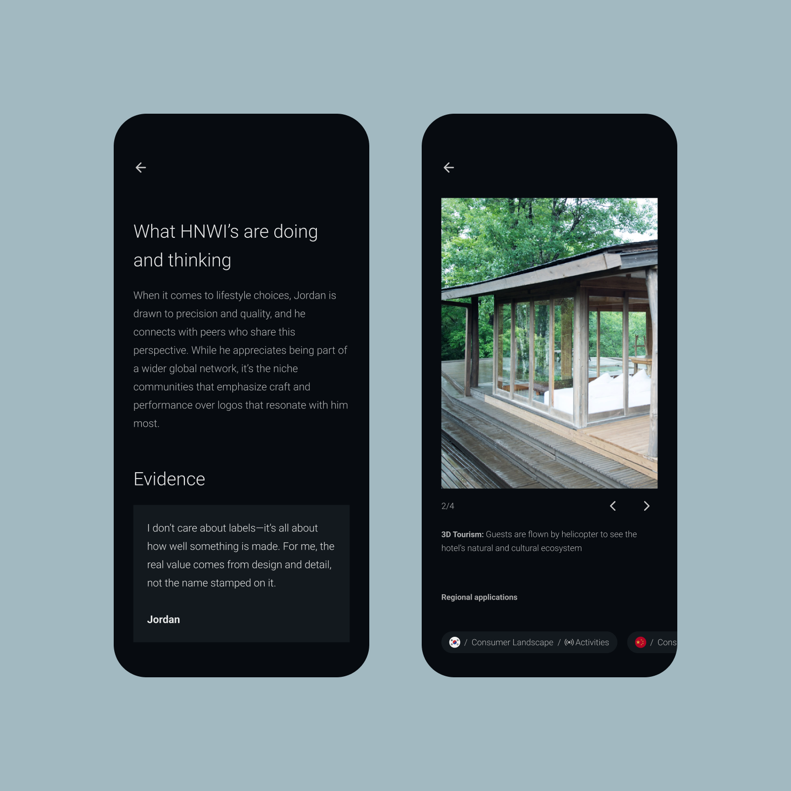
Interactions that educate and create alignment.
In presentations, complex models were explained with voice-overs — but once the decks were shared, that context disappeared. Without explanation, many concepts were difficult to grasp.
We applied interaction design principles to make these models clearer, more engaging, and easier to interpret on their own, reducing confusion and misalignment.

THE DESIGN SYSTEM
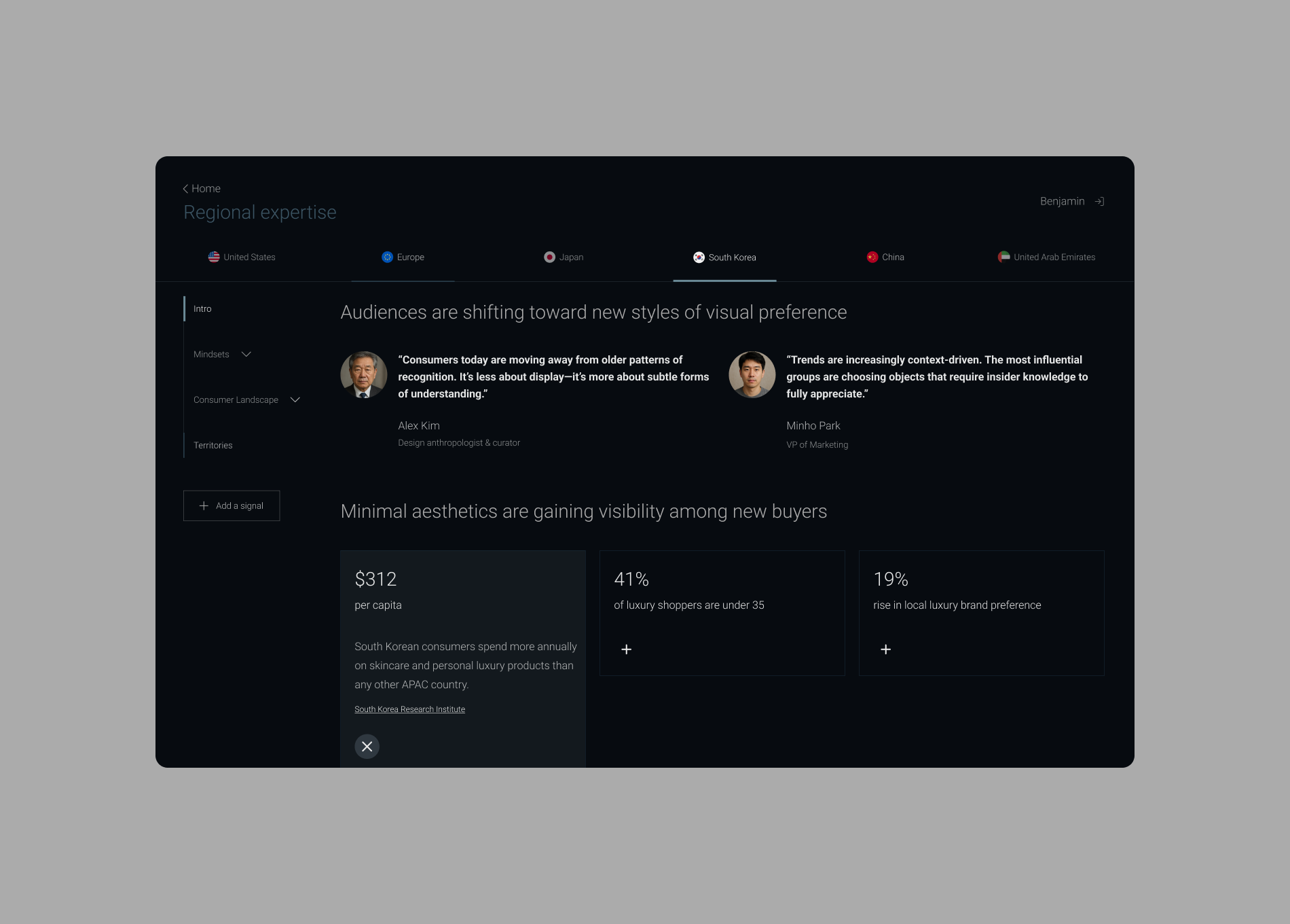
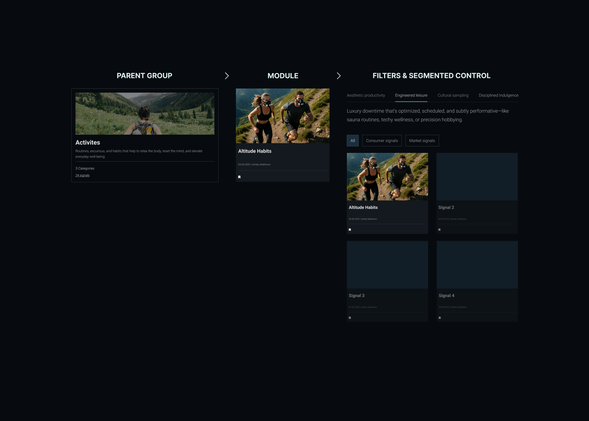
Simple and intuitive navigation.
Strategists often grouped and sorted insights in many different ways. We used familiar UI patterns like segmented controls and filters, along with consistent visual cues, to make navigating the complex database intuitive — without disrupting how teams already thought about their insights.

HIGHLIGHT FEATURE
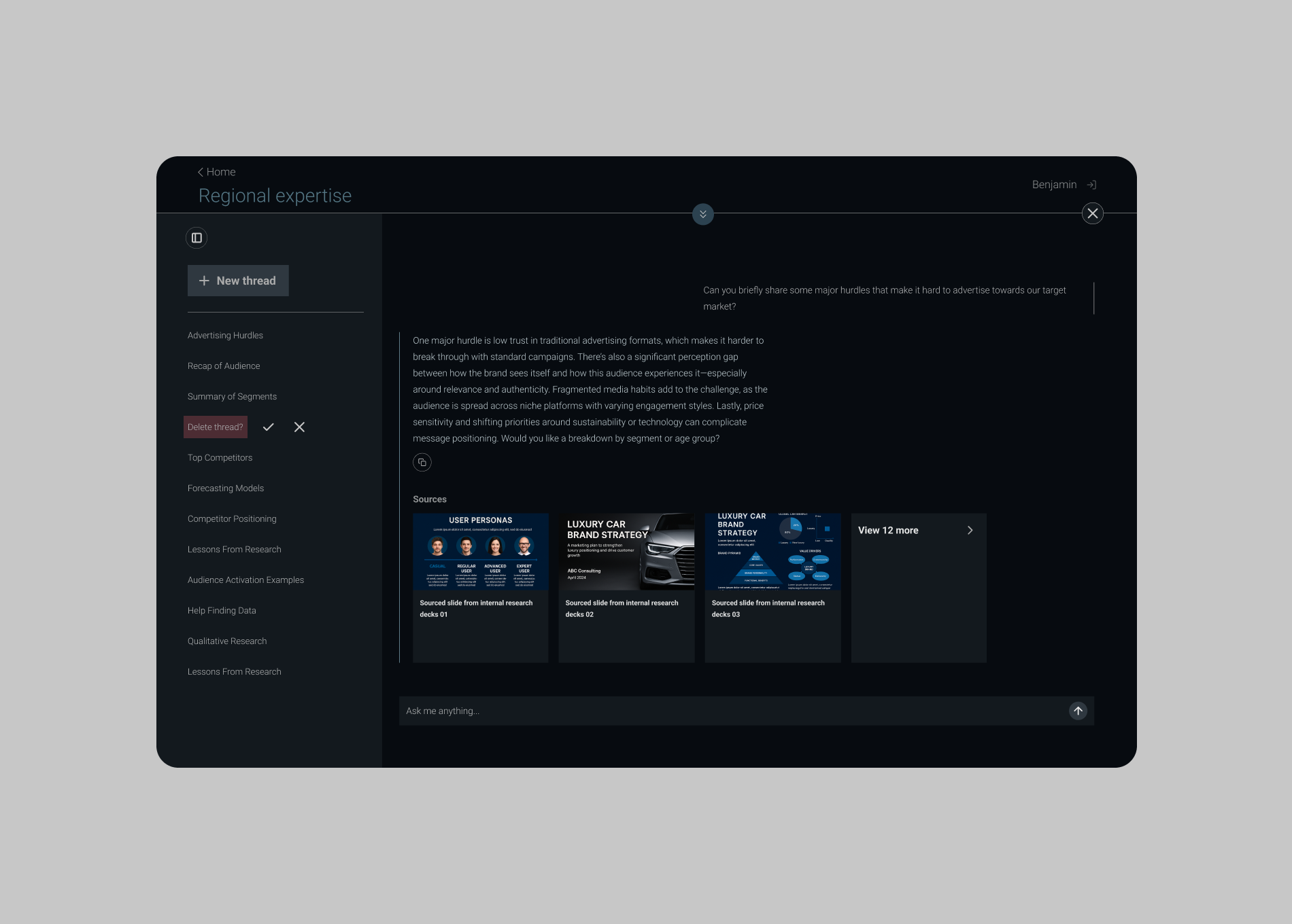
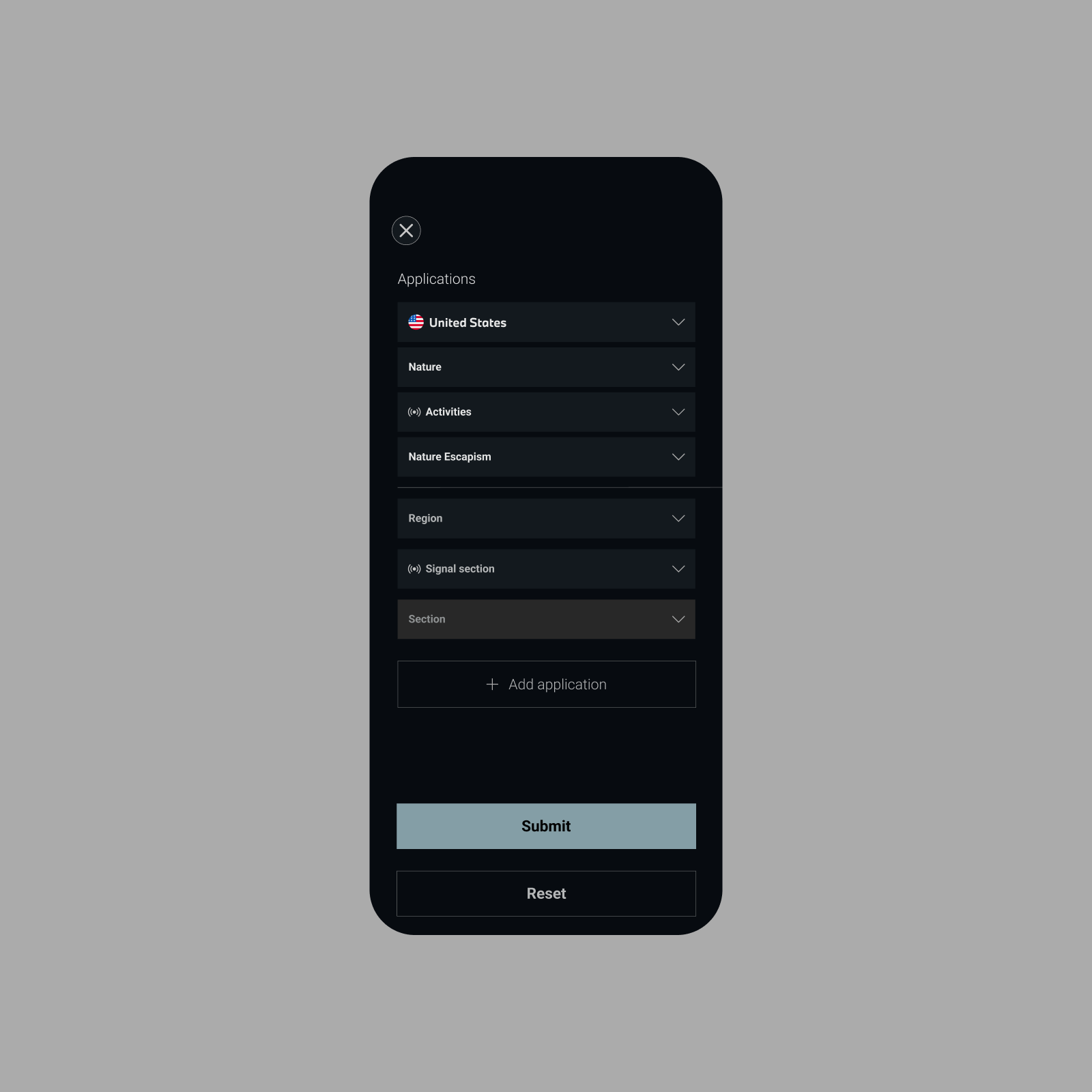
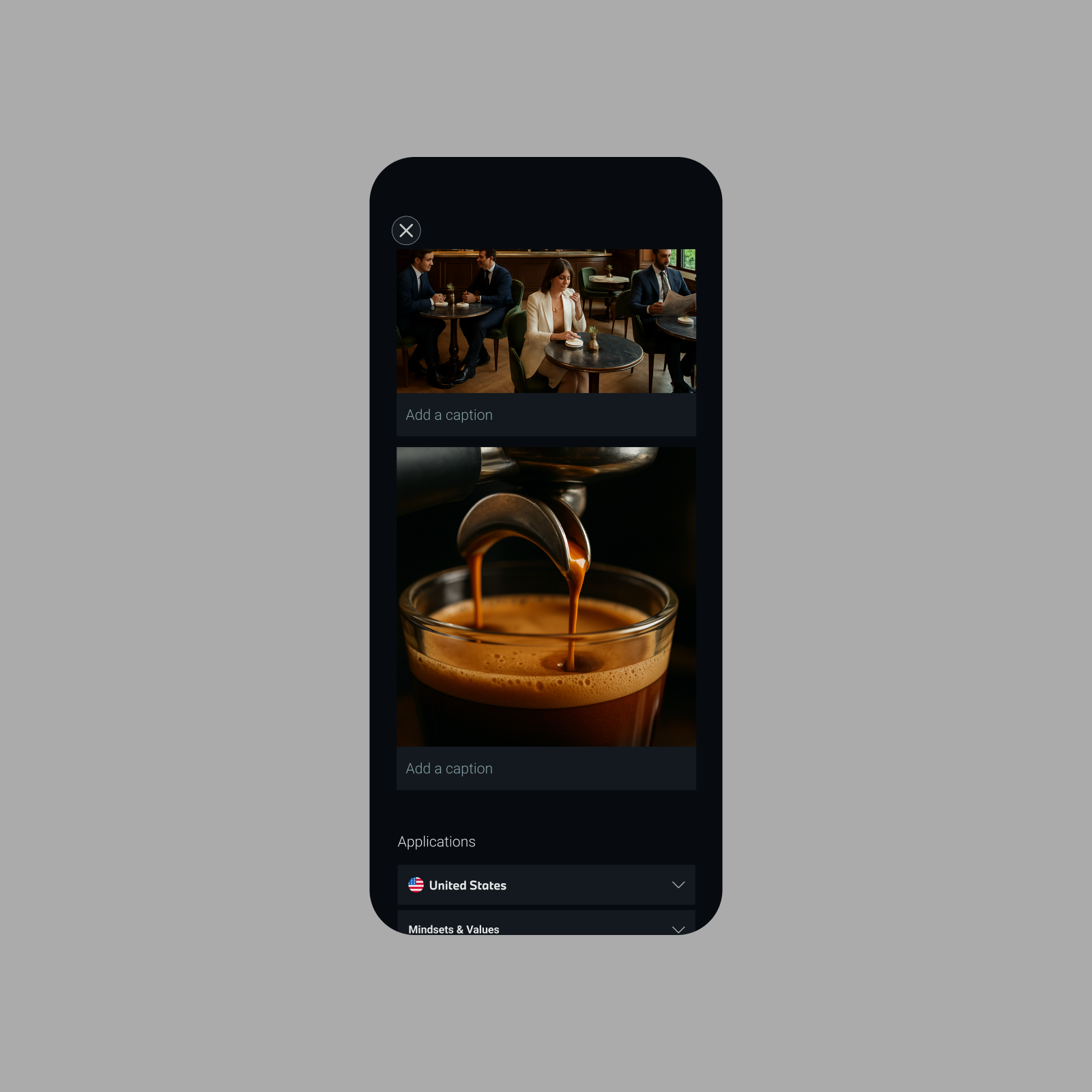
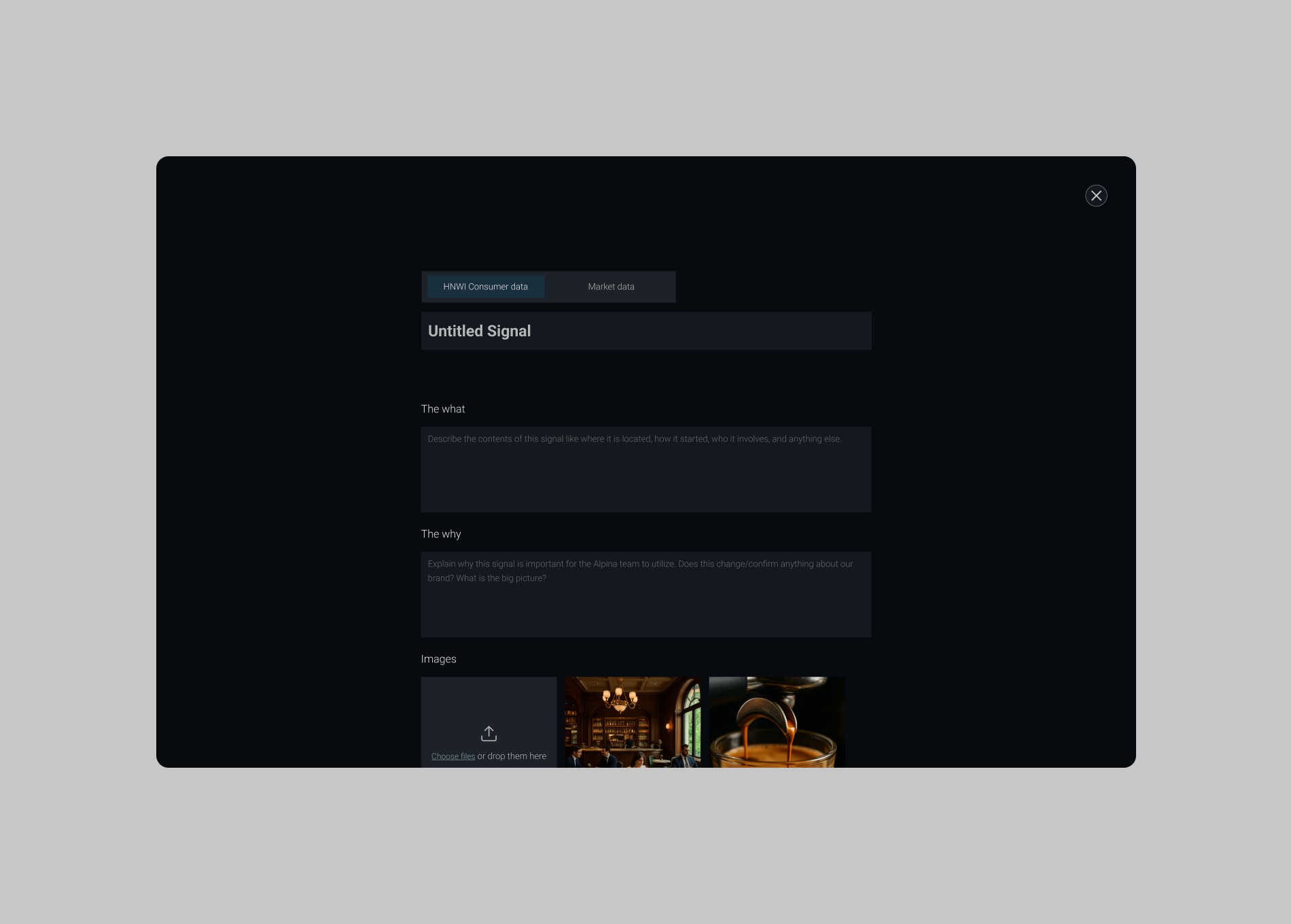
Empowering scale.
Adding and growing information quickly was critical, since research was happening constantly across the globe. We built a lightweight, easy-to-use interface connected to a simple Notion database, enabling teams to add insights directly and efficiently.
Empowering scale.
Adding and growing information quickly was critical, since research was happening constantly across the globe. We built a lightweight, easy-to-use interface connected to a simple Notion database, enabling teams to add insights directly and efficiently.

THE RESULT
+600 new insights within 3 months.
Within three months of launch, the internal teams added over 600 insights — validating the effectiveness of our modular design system and seamless scaling capabilities.
+600 new insights within 3 months.
Within three months of launch, the internal teams added over 600 insights — validating the effectiveness of our modular design system and seamless scaling capabilities.
Credits
Louis Elton (Director)
Josh Sheperd-Smith (Senior Strategist)
Eve Farah (Strategist)
Benjamin Pape (Digital Developer)
Year
2025
Services
Product design
Product strategy
Design system
Louis Elton (Director)
Josh Sheperd-Smith (Senior Strategist)
Eve Farah (Strategist)
Benjamin Pape (Digital Developer)
Year
2025
Services
Product design
Product strategy
Design system