MoveWise
Generating a 35% increase in average student activity
Digital Product • Launched in early 2025

Role
UX/UI Designer
UX/UI Designer
Timeline
March - May 2025
March - May 2025
Team Structure
1 Partner
1 Strategy director
4 Strategists
1 Developer
2 Designers
1 Partner
1 Strategy director
4 Strategists
1 Developer
2 Designers
Tools & Skills
Figma
Product strategy
Product design
Design system
Wireframing
Figma
Product strategy
Product design
Design system
Wireframing
Overview
After a successful pilot led by a team of researchers, our client set out to scale a new physical education program to schools nationwide. The concept for MoveWise—a digital platform designed to help teachers integrate the program into their classrooms—was already in place.
With core features defined by stakeholders and executives, the real need was to establish strong UX foundations and bring clarity and direction to the product as it took shape. Working within a tight three-month timeline and a small team of two designers and 1 developer, we operated in a highly agile, fast-paced environment.
Defining the UX foundation for a nationwide physical education platform, from 0→1
After a successful pilot led by a team of researchers, our client set out to scale a new physical education program to schools nationwide. The concept for MoveWise—a digital platform designed to help teachers integrate the program into their classrooms—was already in place.
With core features defined by stakeholders and executives, the real need was to establish strong UX foundations and bring clarity and direction to the product as it took shape. Working within a tight three-month timeline and a small team of two designers and 1 developer, we operated in a highly agile, fast-paced environment.
Solution
Bringing the focus to teachers and their everyday contexts
While stakeholders had a clear vision for what the platform needed to include, there was no shared understanding of how it should support teachers’ real-world contexts and needs—nor a design foundation to create a cohesive, trustworthy experience.
I addressed these gaps by defining the product’s UX strategy, establishing the design system, and leading the interface design.
Deliverable 1
A UX strategy that puts teachers at the center of the experience

Deliverable 2
An approachable and scalable design system
Deliverable 3
Designing and improving key interfaces and flows
Key insights
Low digital literacy and competing priorities
With limited time and a highly cross-functional team, I focused on shaping a clear product strategy to simplify decision-making and create alignment. I conducted short interviews with teachers and stakeholders to understand their daily realities and past experiences with digital tools. Two key considerations emerged:
User Consideration 1
Assume low digital literacy
Assume low digital literacy
The user interface must be intuitive and forgiving – revealing information through careful progression.
User Consideration 2
Acknowledge competing priorities
Acknowledge competing priorities
The program isn’t a daily focus—so the design should motivate and encourage, not strain.
Product strategy
An actionable UX strategy that creates focus and alignment
Grounded in these user insights, I created an actionable product design strategy that aligned the entire team, guiding everything from content decisions to new user flows.
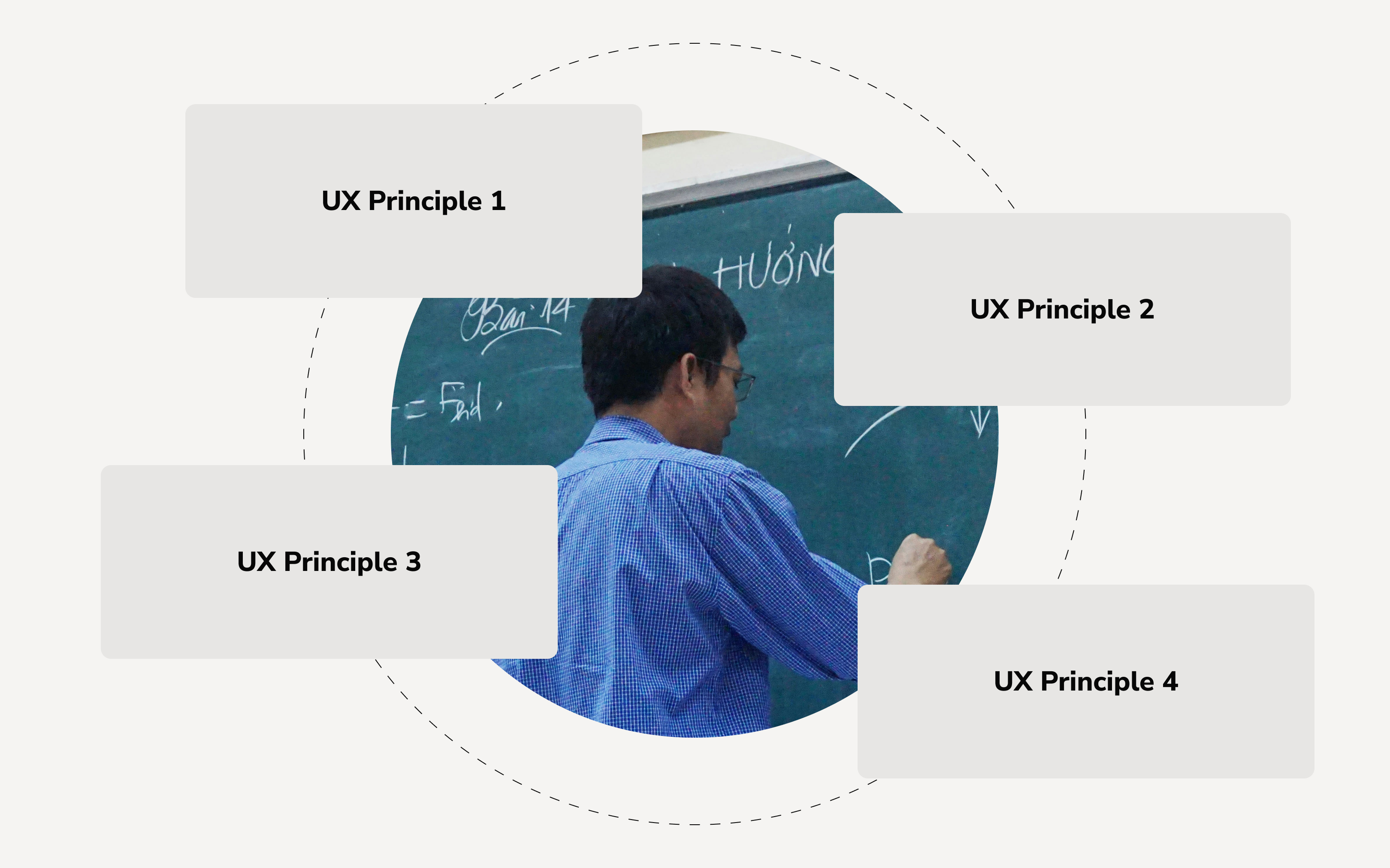
UX Principle 1
Leverage familiar UX mental models from popular tools.
UX Principle 2
Break content into digestible, bite-sized pieces.
UX Principle 3
Sustain teacher engagement by celebrating progress often.
UX Principle 4
Surface only essential, actionable information, and utilize progressive disclosure.
Design System
Playful, approachable, and human
We crafted a design system that helped the user experience feel approachable, energizing, and fun.
Playful, approachable, and human
We crafted a design system that helped the user experience feel approachable, energizing, and fun.
- A bright and energetic color palette
- Nunito sans typeface: a highly legible and modern neo-grotesque typeface with approacable, humanist qualities
- Rounded corners and soft elevations
- Modular components for easy content addition

Feature 1
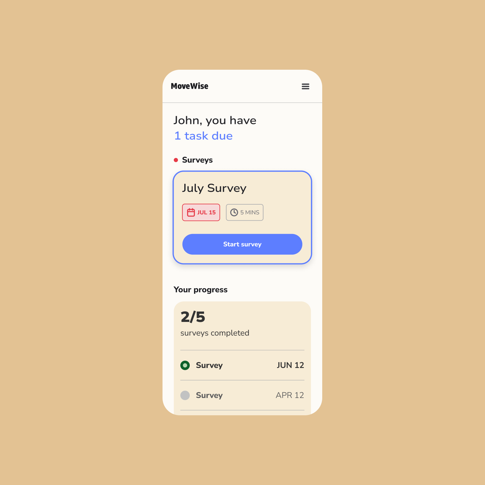
Bit-sized, encouraging lessons
To respect teachers’ time and cognitive load, lessons were broken into short, 5–10 minute sessions. Progress tracking and lightweight celebration reinforced momentum and encouraged continued engagement.
Bit-sized, encouraging lessons
To respect teachers’ time and cognitive load, lessons were broken into short, 5–10 minute sessions. Progress tracking and lightweight celebration reinforced momentum and encouraged continued engagement.
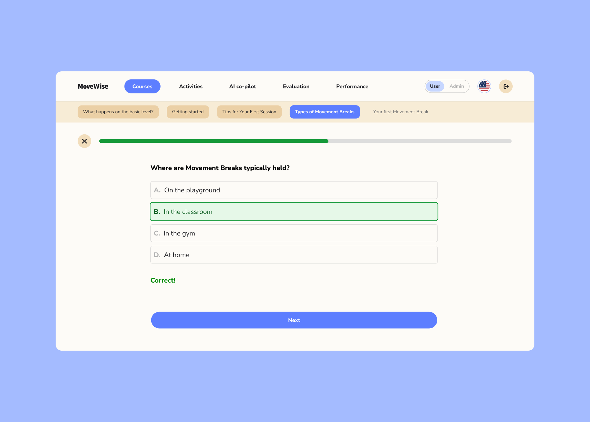
By clearly showing progress and what was coming next, teachers stayed motivated and confident using the platform.
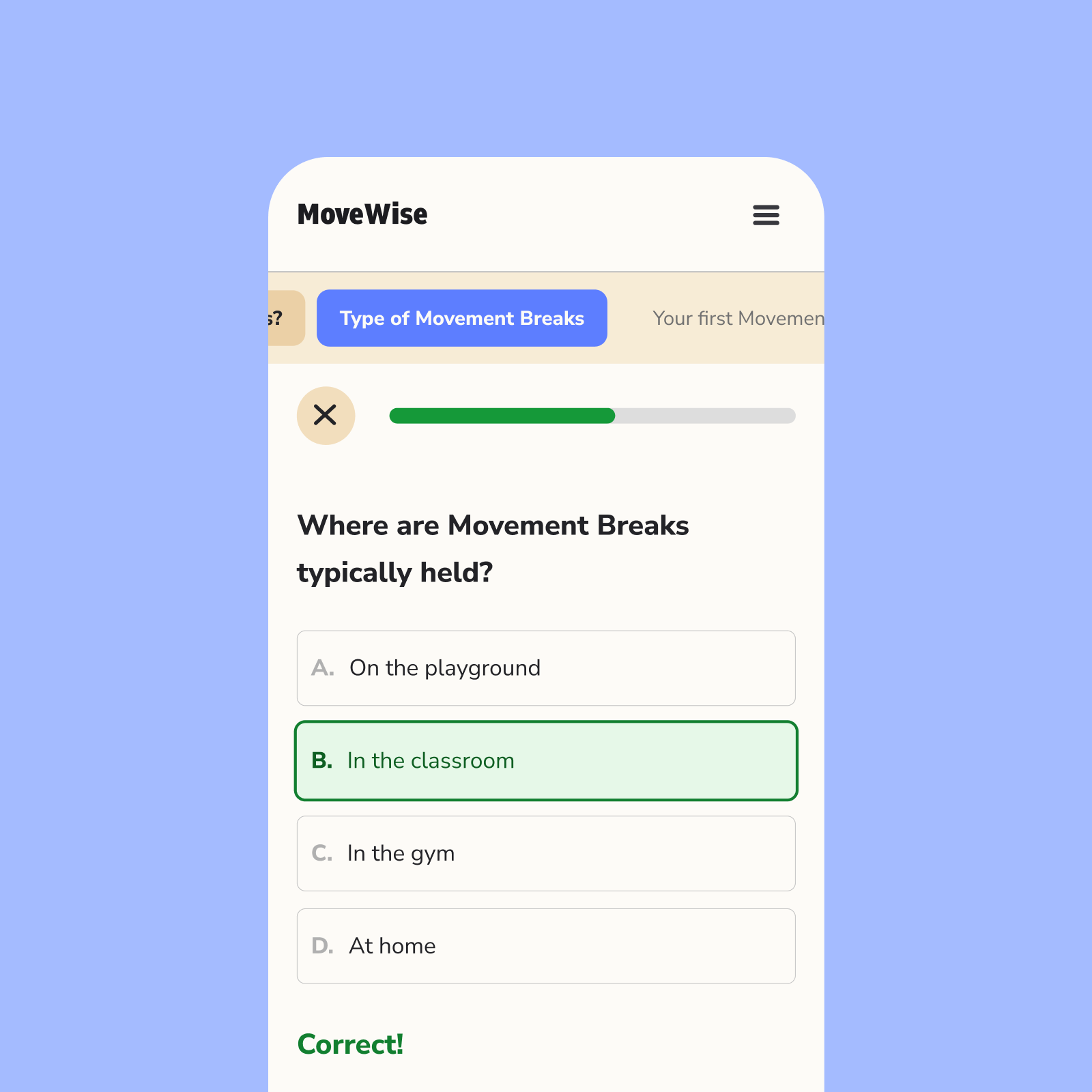
Clear progress and upcoming sections help users stay motivated and feel in control.
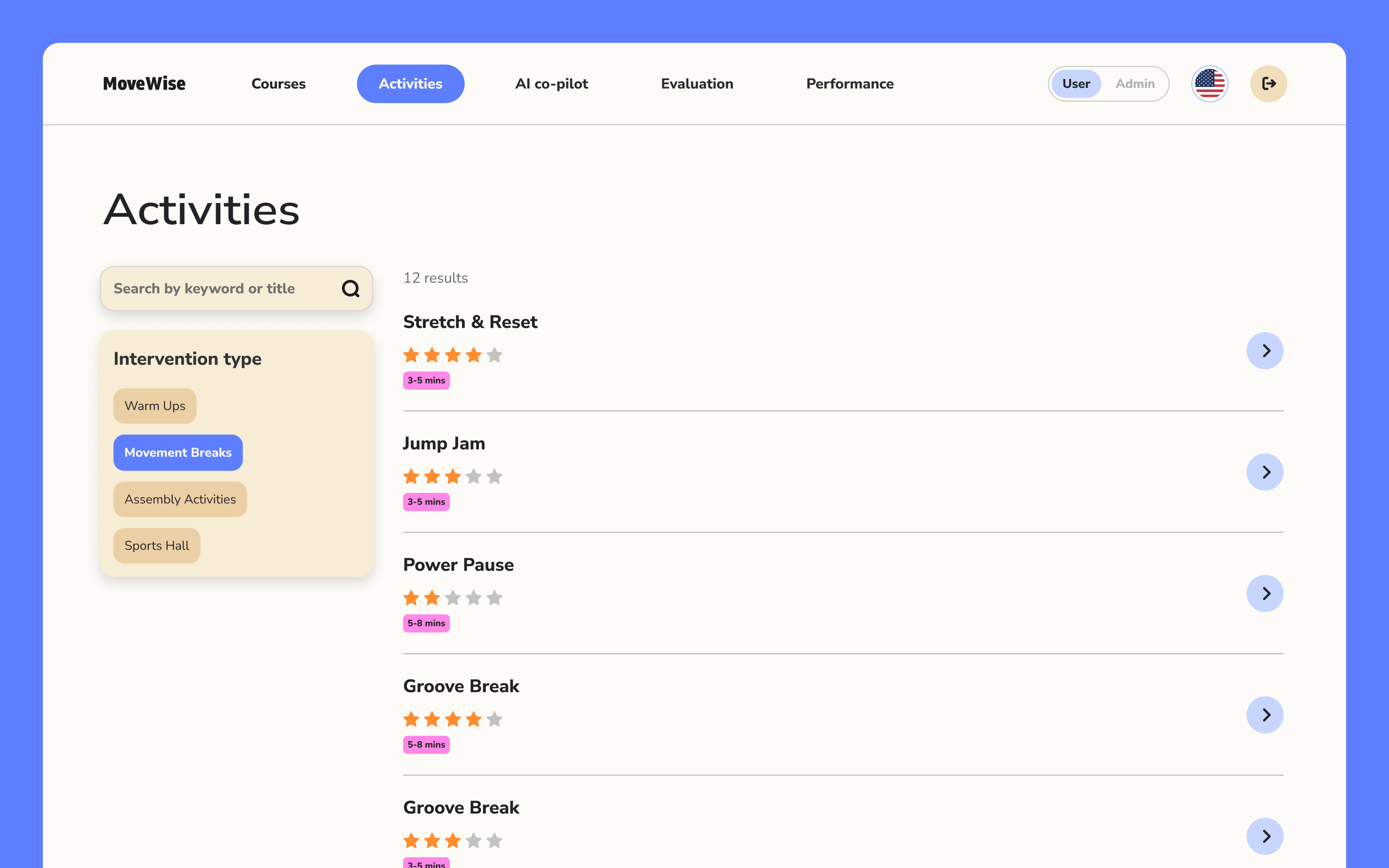
Feature 2
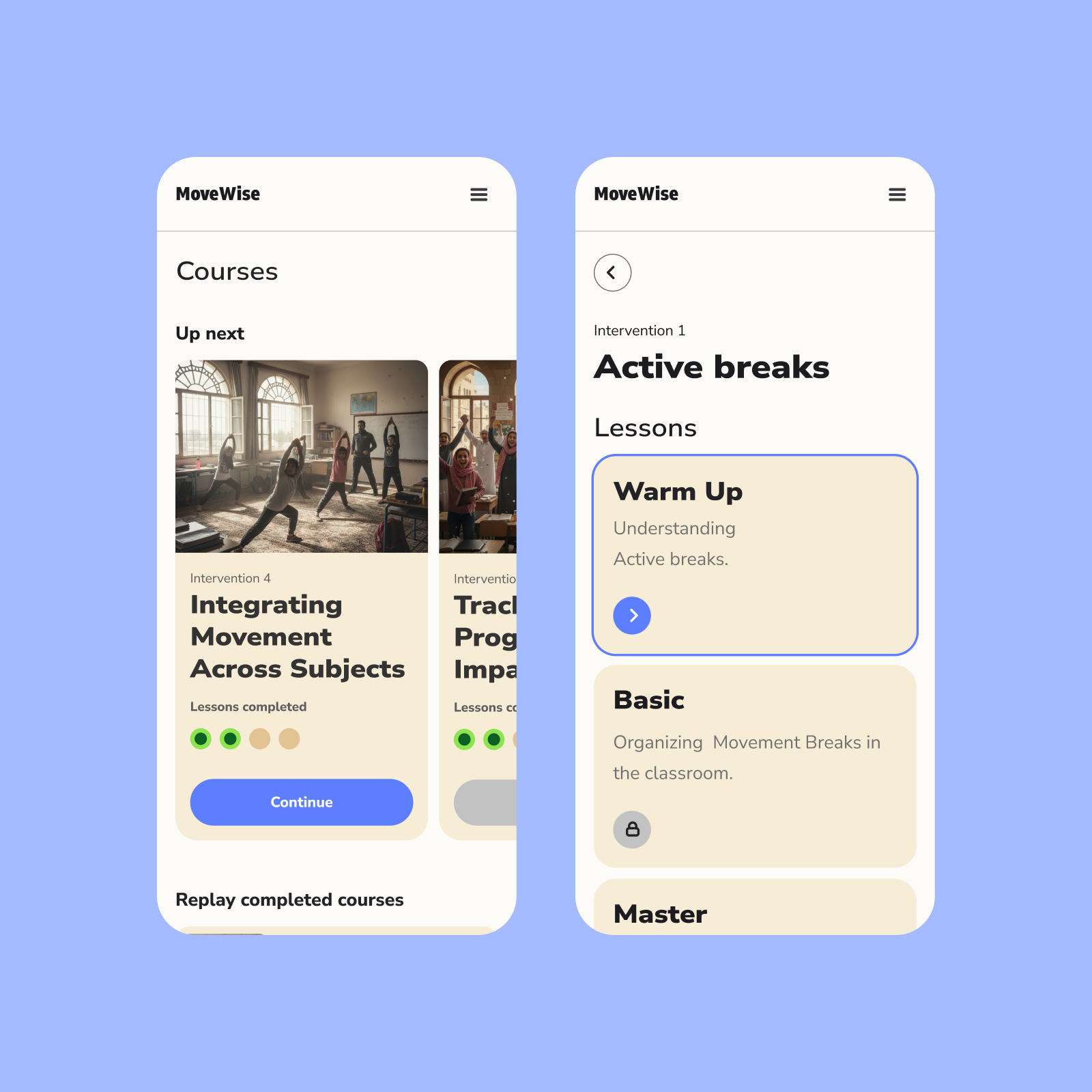
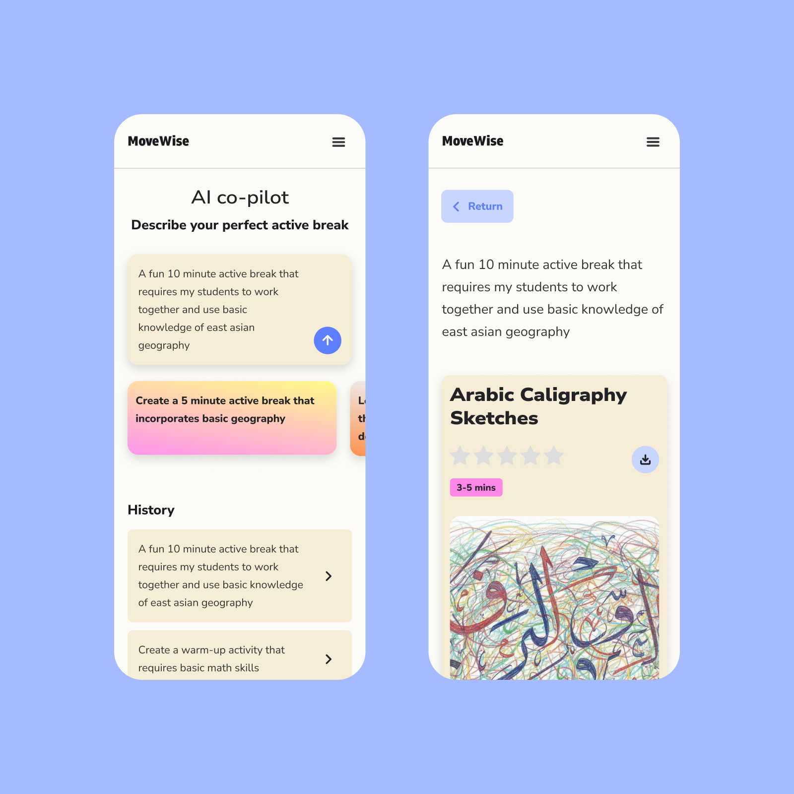
Activity search
Teachers can find activities from a comprehensive library.
Activity search
Teachers can find activities from a comprehensive library.
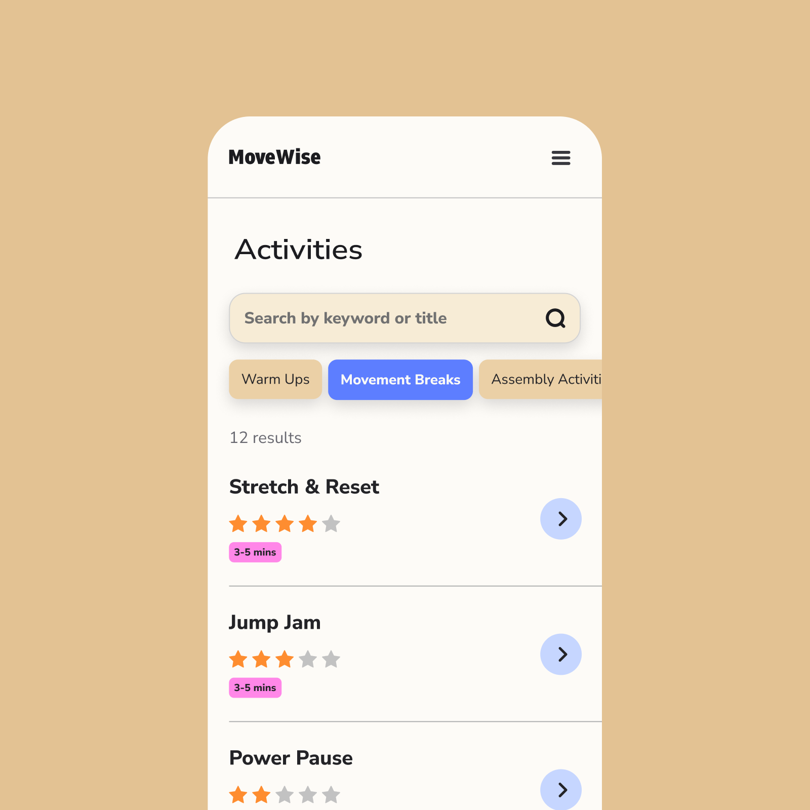
To prevent cognitive overload, we streamlined filtering into a few clear, easy-to-scan categories.
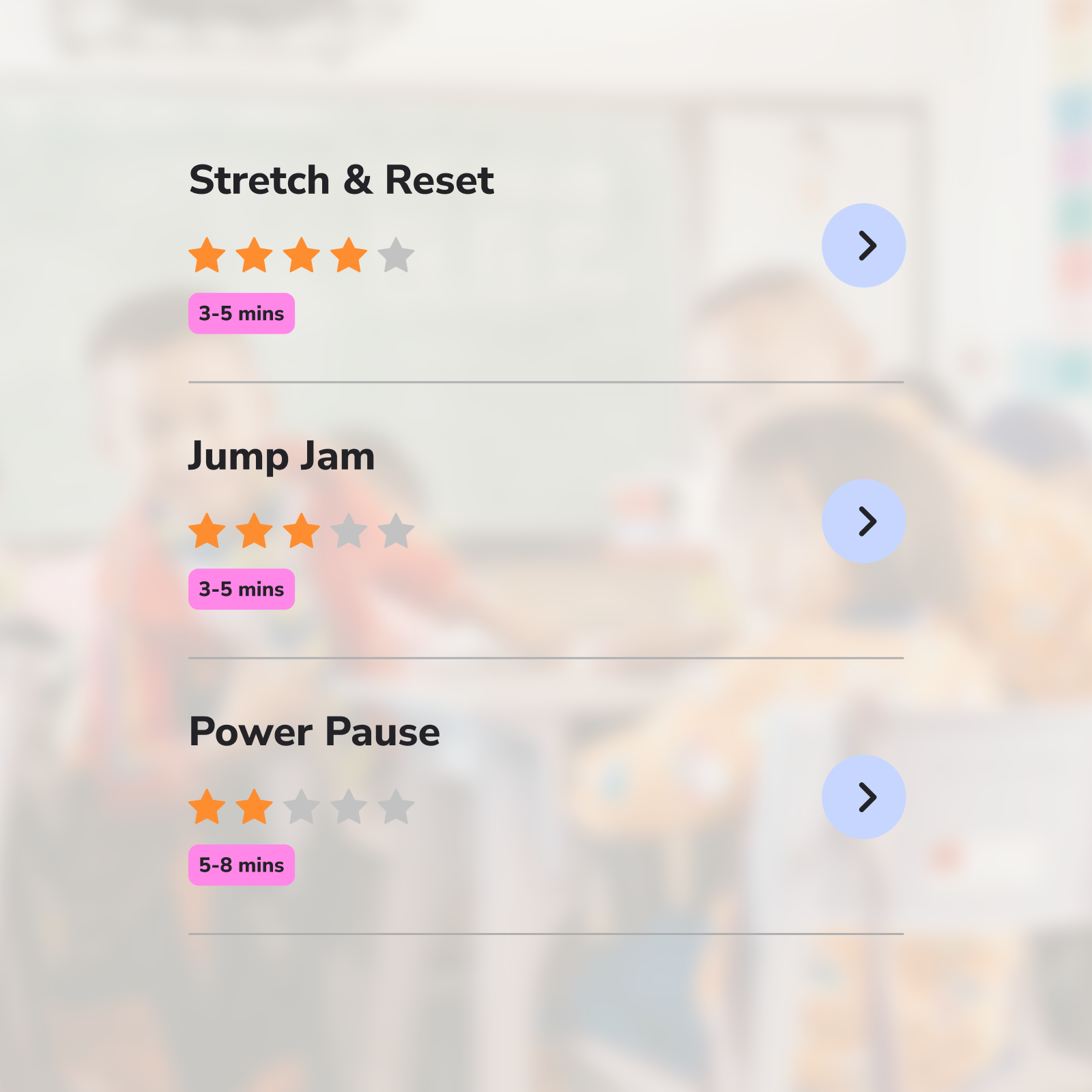
Teachers can quickly rank activities and understand how long they’ll take, helping them choose what fits their day.
Feature 3
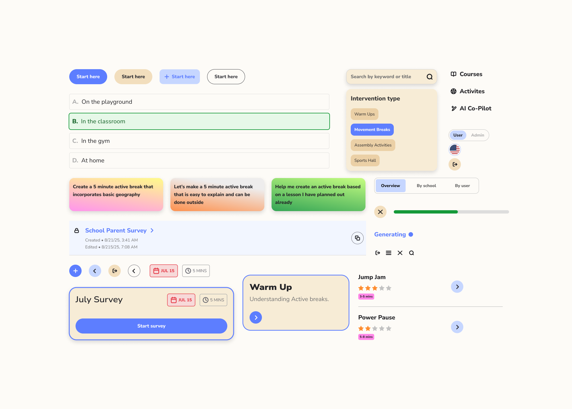
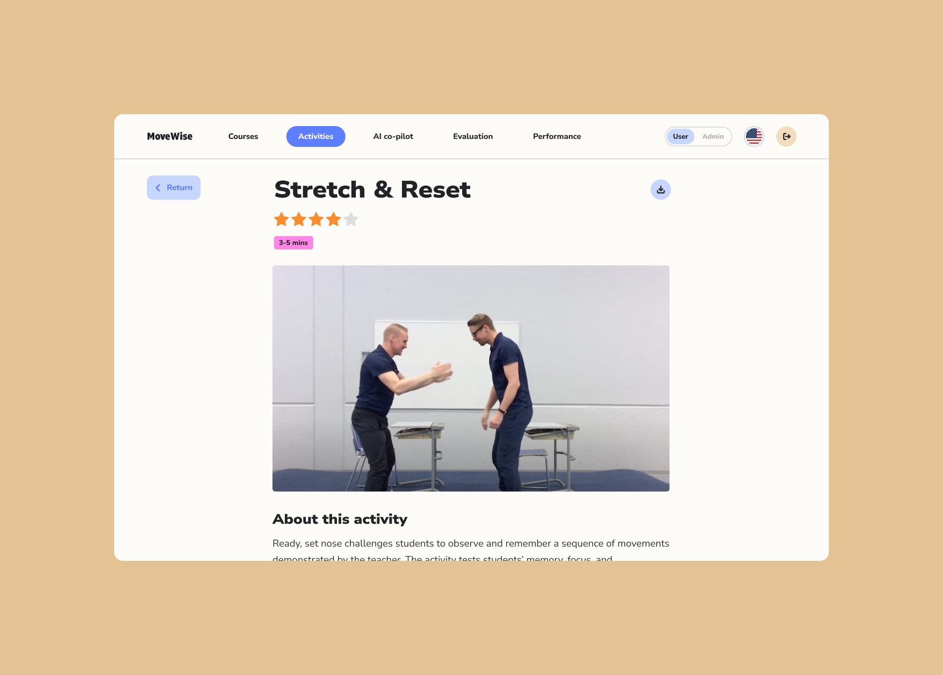
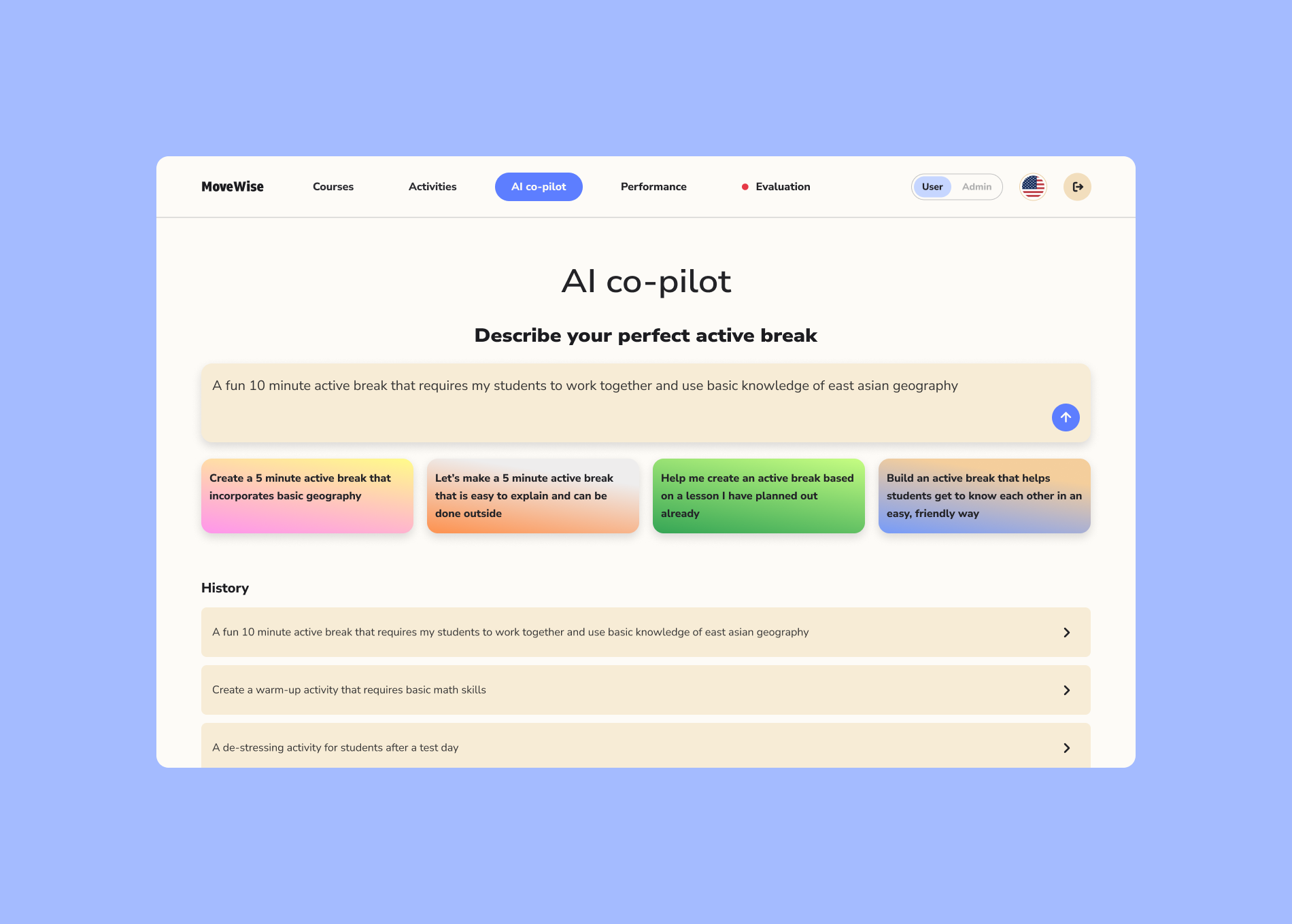
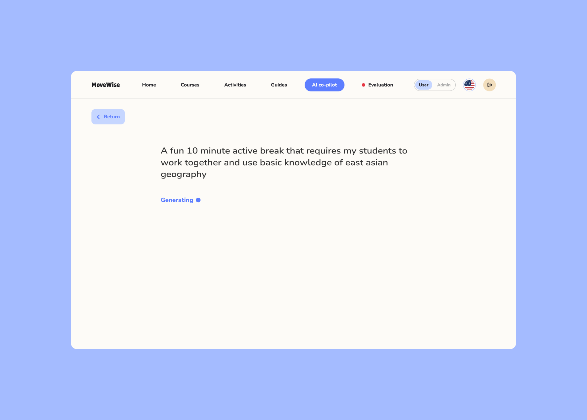
AI-assisted activity creation
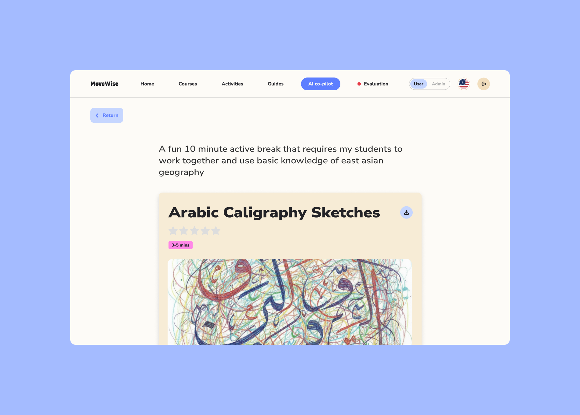
Empowering teachers and students to create their own activities through generative AI.
AI-assisted activity creation
Empowering teachers and students to create their own activities through generative AI.
Feature 4
Evaluate performance
A dashboard that gives administrators a clear-view of the program’s progress with data visualizations.
Evaluate performance
A dashboard that gives administrators a clear-view of the program’s progress with data visualizations.
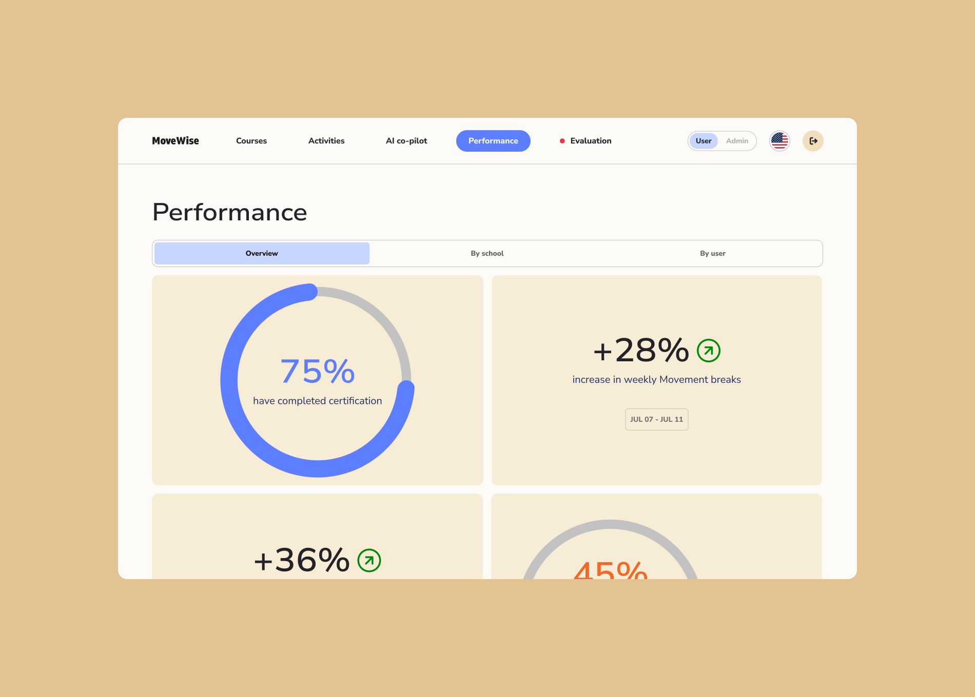
In order to help increase survey completion, we added due dates and completion time, as well as a progress tracker to help motivate.
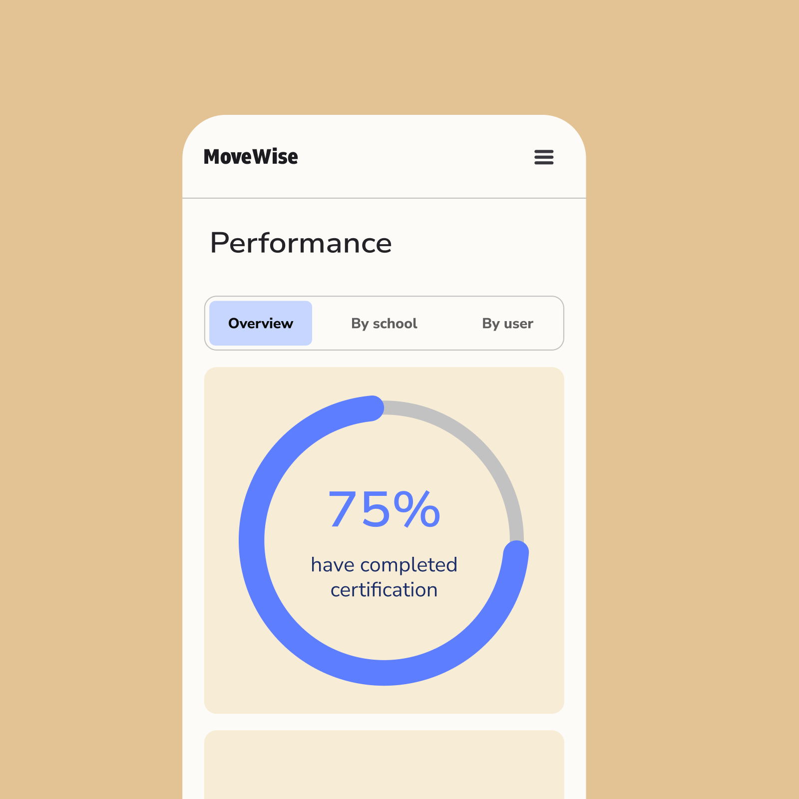
We turned data into simple visualizations, helping administrators get an overall view of progress.
The Result
A 35% increase in average student activity
After helping develop the foundational UX and strategy, the team was able to build this entire platform in less than 6 months.
After rollout, schools using the platform saw a 35% increase in average student activity, surpassing the WHO’s daily recommendation of 60 minutes. The platform not only scaled the program efficiently but also re-energized teachers and students alike—making movement an everyday norm.
Credits
Jere Seikkala (Partner)
Iida Pyy (Strategist)
Sara Bernat (Strategist)
Benjamin Pape (Digital Developer)
Year
Early 2025
Services
UX/UI design
Product strategy
Design system
Jere Seikkala (Partner)
Iida Pyy (Strategist)
Sara Bernat (Strategist)
Benjamin Pape (Digital Developer)
Year
Early 2025
Services
UX/UI design
Product strategy
Design system