MoveWise
Generating a 35% increase in average student activity
Building a digital platform from 0-1 that empowers teachers to learn and execute physical interventions, helping our client scale a nationwide education program.

PROJECT OVERVIEW
Scaling an education program.
Afer a successful pilot of a new physical education program, our client wanted to expand the initiative across thousands of schools nationwide.
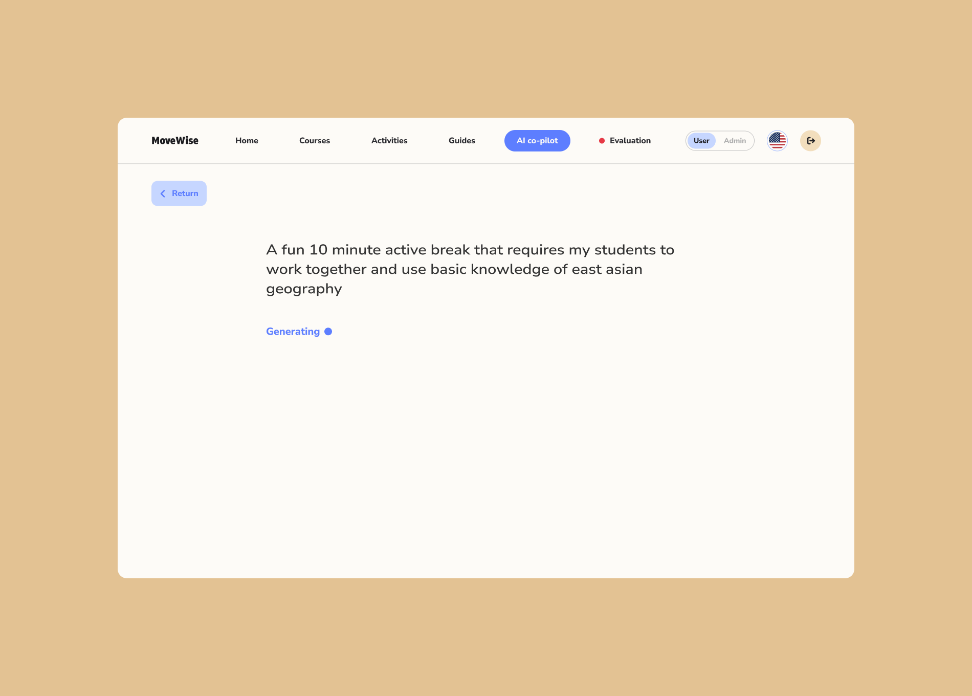
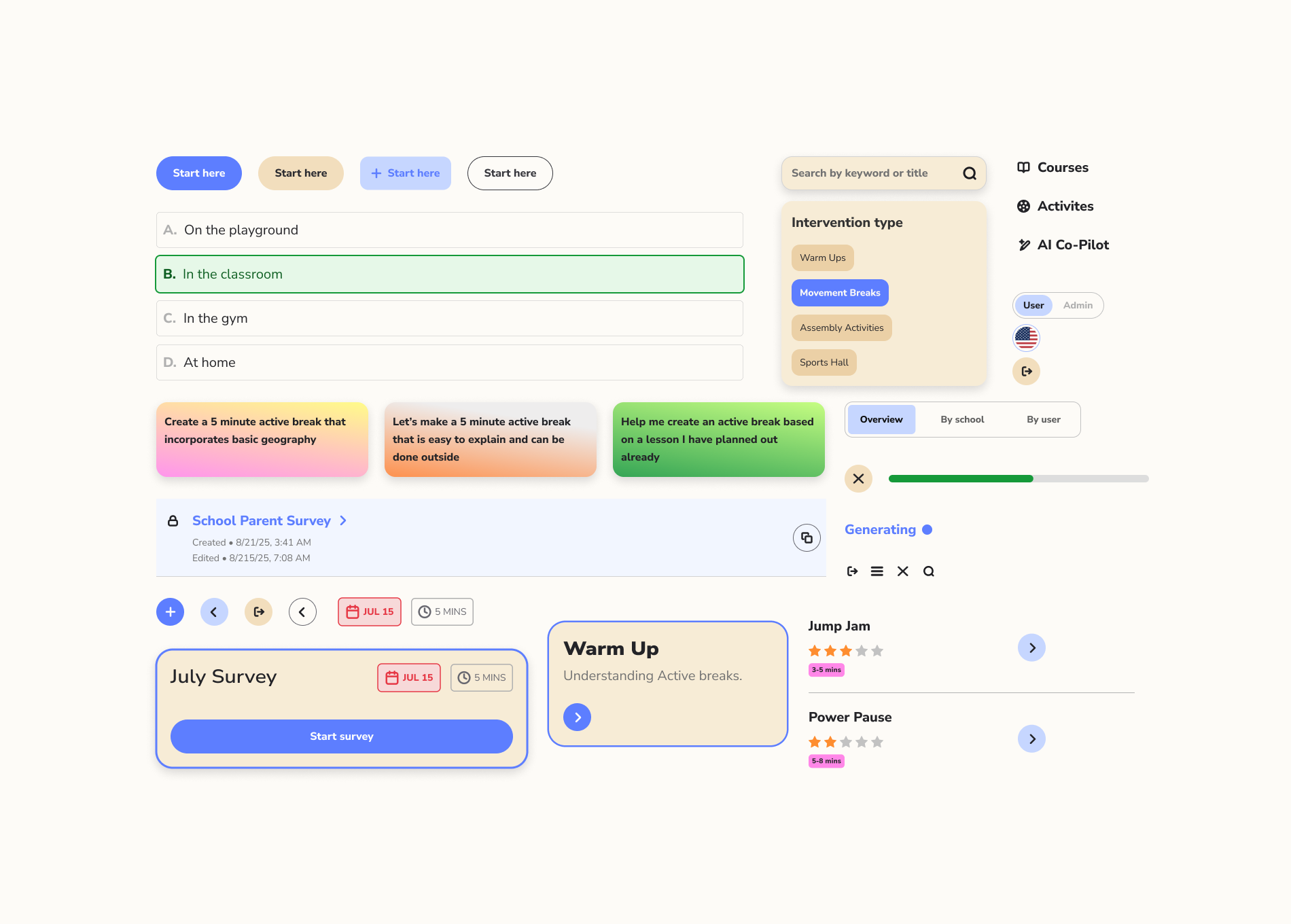
We built MoveWise, a user-friendly digital platform that gives teachers the tools and confidence to seamlessly integrate the program seamlessly into their classrooms.
Key platform features:
Scaling an education program.
Afer a successful pilot of a new physical education program, our client wanted to expand the initiative across thousands of schools nationwide.
We built MoveWise, a user-friendly digital platform that gives teachers the tools and confidence to seamlessly integrate the program seamlessly into their classrooms.
Key platform features:
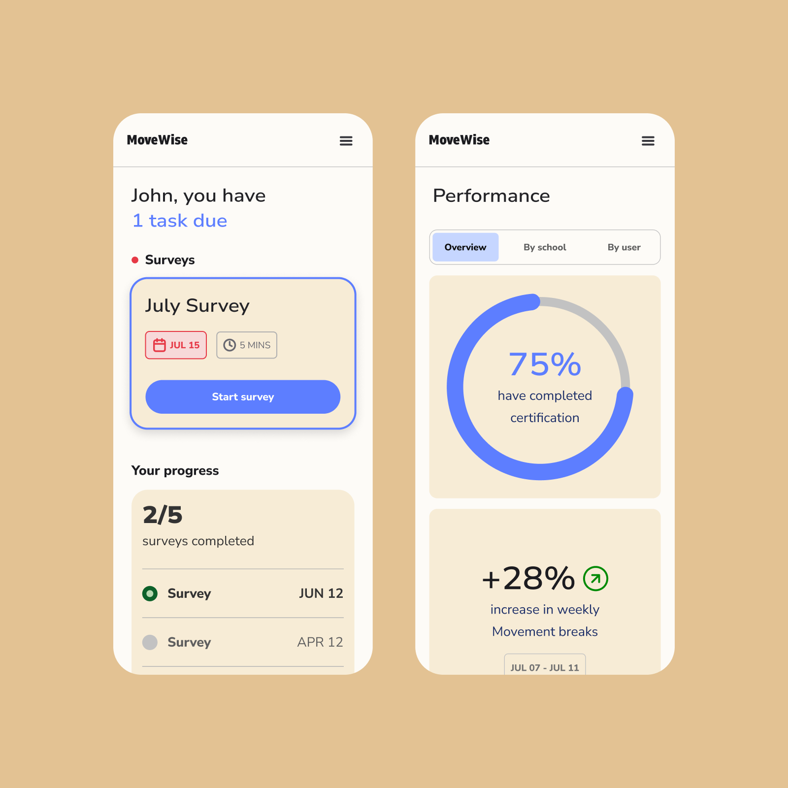
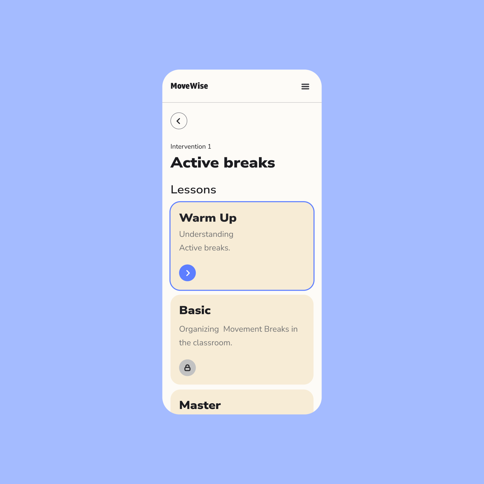
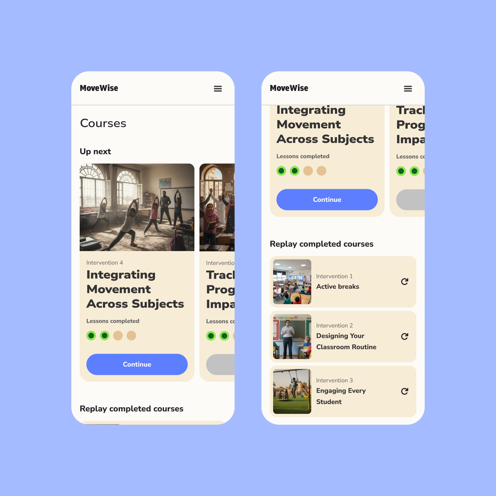
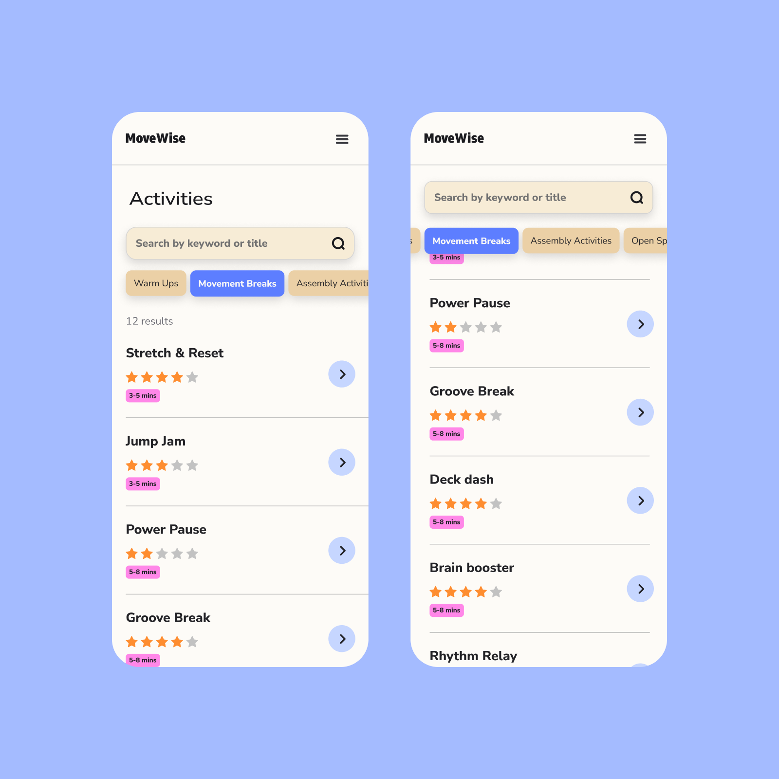
- Offers teacher training and resources
- Houses a library of physical activity guides
- Includes an AI-powered routine builder
- Provides analytics to track progress across schools and students

USER RESEARCH
Grounding the design in real classroom contexts.
With limited time for formal user research, we relied on stakeholder interviews and conversations with teachers to uncover key design considerations that helped guide our design process. We synthetized the feedback and conversation points into two, highly important considerations.
USER CONSIDERATION 1
Assume low digital literacy.
Assume low digital literacy.
The user interface must be intuitive, simple, and forgiving.
USER CONSIDERATION 2
Acknowledge competing priorities.
Acknowledge competing priorities.
The program isn’t a daily focus—so the design should motivate, not add workload.
OUR APPROACH
Turning our insights into an actionable UX strategy.
In order to speed up our design and decision making process, I created four actionable UX strategy principles. These gave the team focus and alignment which allowed us to quickly unify our approach to interface design, content strategy, and overall product direction.
UX PRINCIPLE 1
Leverage familiar UX mental models from popular tools.
Leverage familiar UX mental models from popular tools.
UX PRINCIPLE 2
Break content into digestible, bite-sized pieces.
Break content into digestible, bite-sized pieces.
UX PRINCIPLE 3
Sustain teacher engagement by celebrating progress often.
Sustain teacher engagement by celebrating progress often.
UX PRINCIPLE 4
Surface only essential, actionable information, and utilize progressive disclosure.
Surface only essential, actionable information, and utilize progressive disclosure.


THE DESIGN SYSTEM
Playful, approachable, and human.
We crafted a design system that helped the user experience feel approachable, energizing, and fun.
Playful, approachable, and human.
We crafted a design system that helped the user experience feel approachable, energizing, and fun.
- Bright, energetic color palette
- Nunito sans: a highly legible, neo-grotesque typeface with humanist qualities and features.
- Rounded corners and soft elevations.
- Modular and scalable components for future content additions.


THE RESULT
A 35% increase in average student activity.
After rollout, schools using the platform saw a 35% increase in average student activity, surpassing the WHO’s daily recommendation of 60 minutes.
The platform not only scaled the program efficiently but also re-energized teachers and students alike—making movement an everyday norm.
Credits
Jere Seikkala (Partner)
Iida Pyy (Strategist)
Benjamin Pape (Digital Developer)
Year
2025
Services
UX/UI design
Product strategy
Design system
Jere Seikkala (Partner)
Iida Pyy (Strategist)
Benjamin Pape (Digital Developer)
Year
2025
Services
UX/UI design
Product strategy
Design system