Healthcare Digital Product and Strategy
IDEATION SPRINT
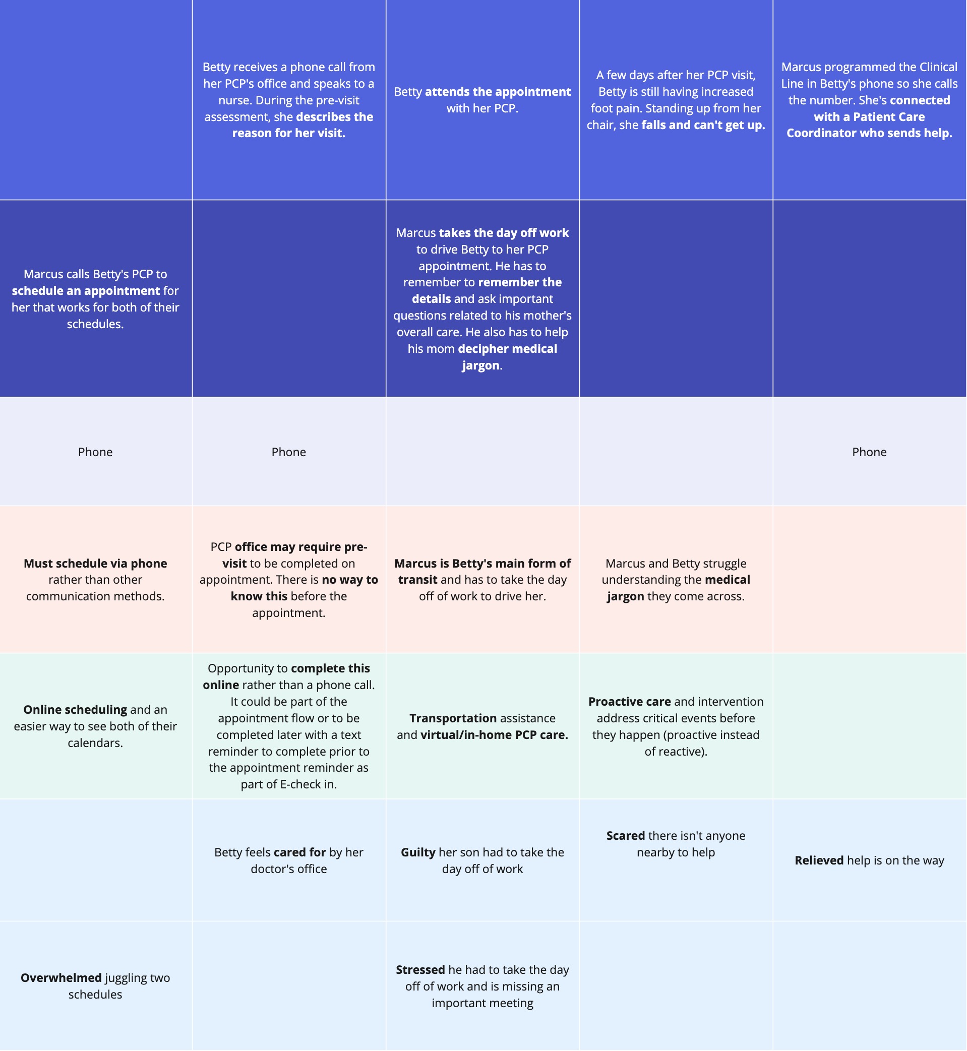
Current + Future State Workshop
Working closely with the client’s stakeholders, we designed two highly collaborative
workshops where a current state and future state journey maps were co-created. These responses and feedback from the workshop helped us visualize the future state through conceptual app screens.
We had discovered that the complexity of Patient/Member and Caregiver journeys had made it difficult to understand insurance benefits, proactively address health concerns, share information across the care team, and navigate the American healthcare provider’s experience.
We had discovered that the complexity of Patient/Member and Caregiver journeys had made it difficult to understand insurance benefits, proactively address health concerns, share information across the care team, and navigate the American healthcare provider’s experience.


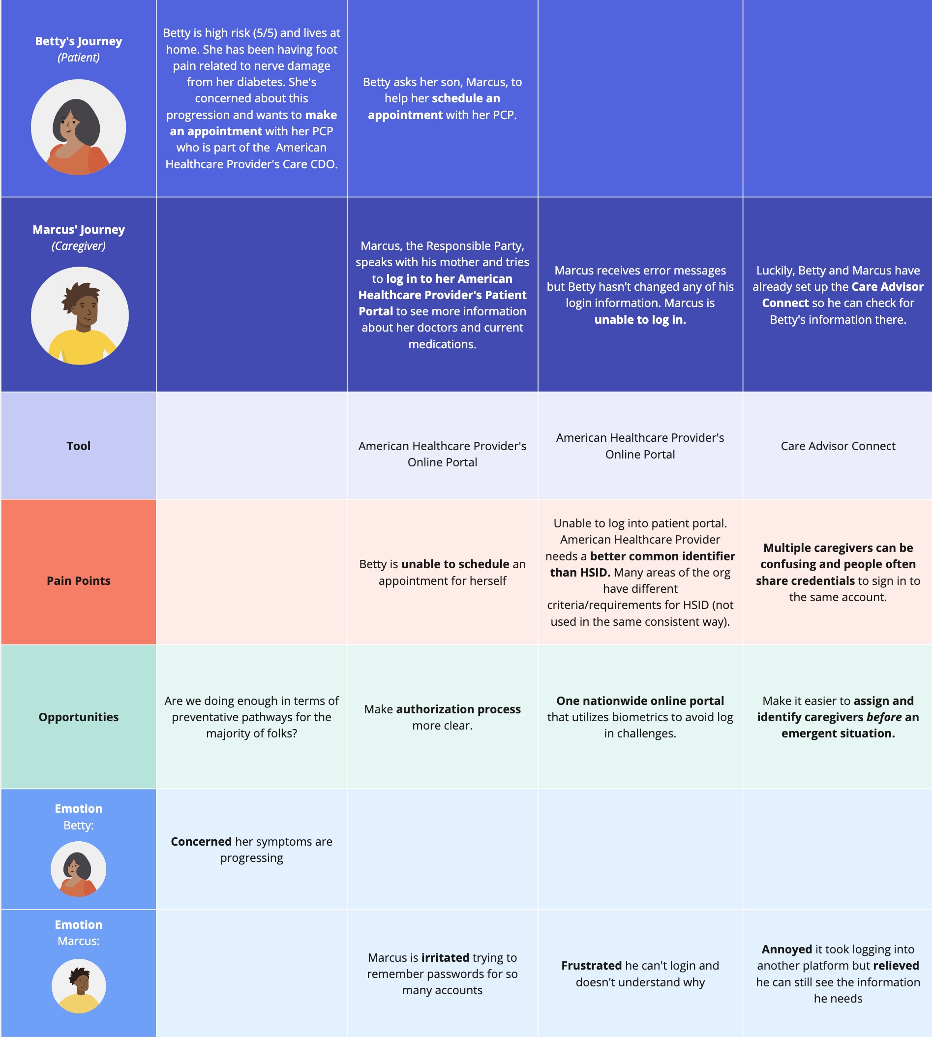
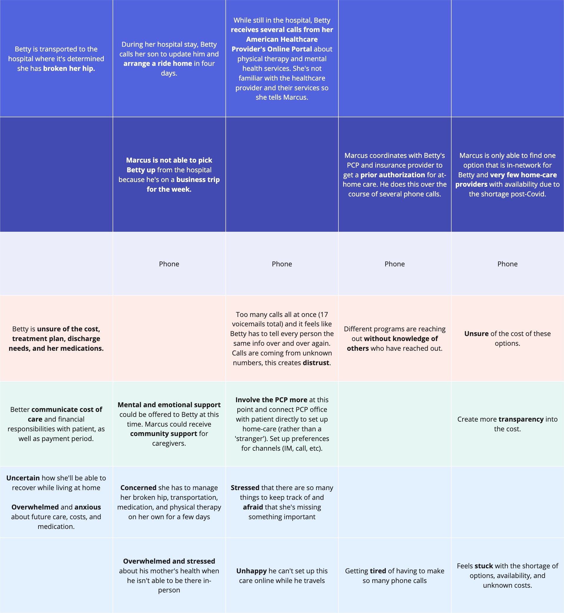
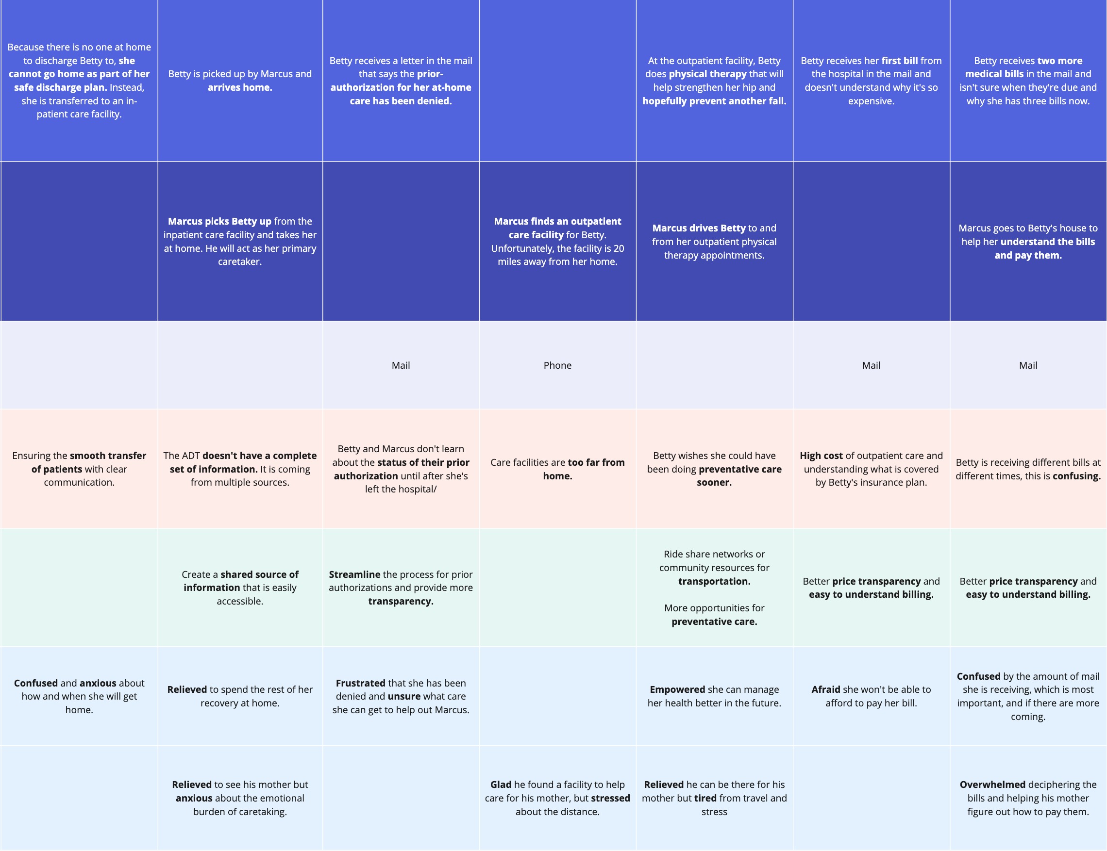
Current state journey map design (use arrows to navigate)
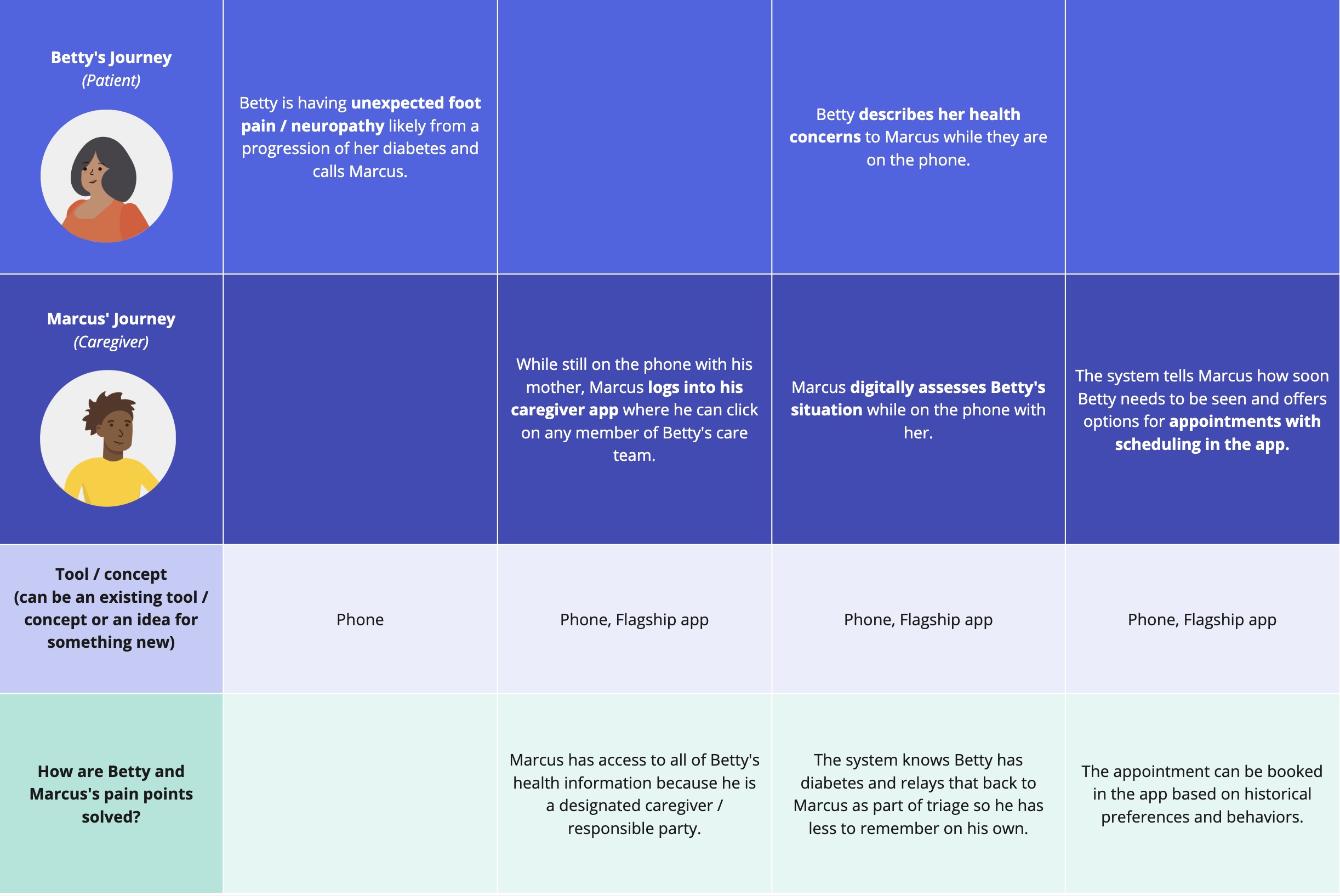
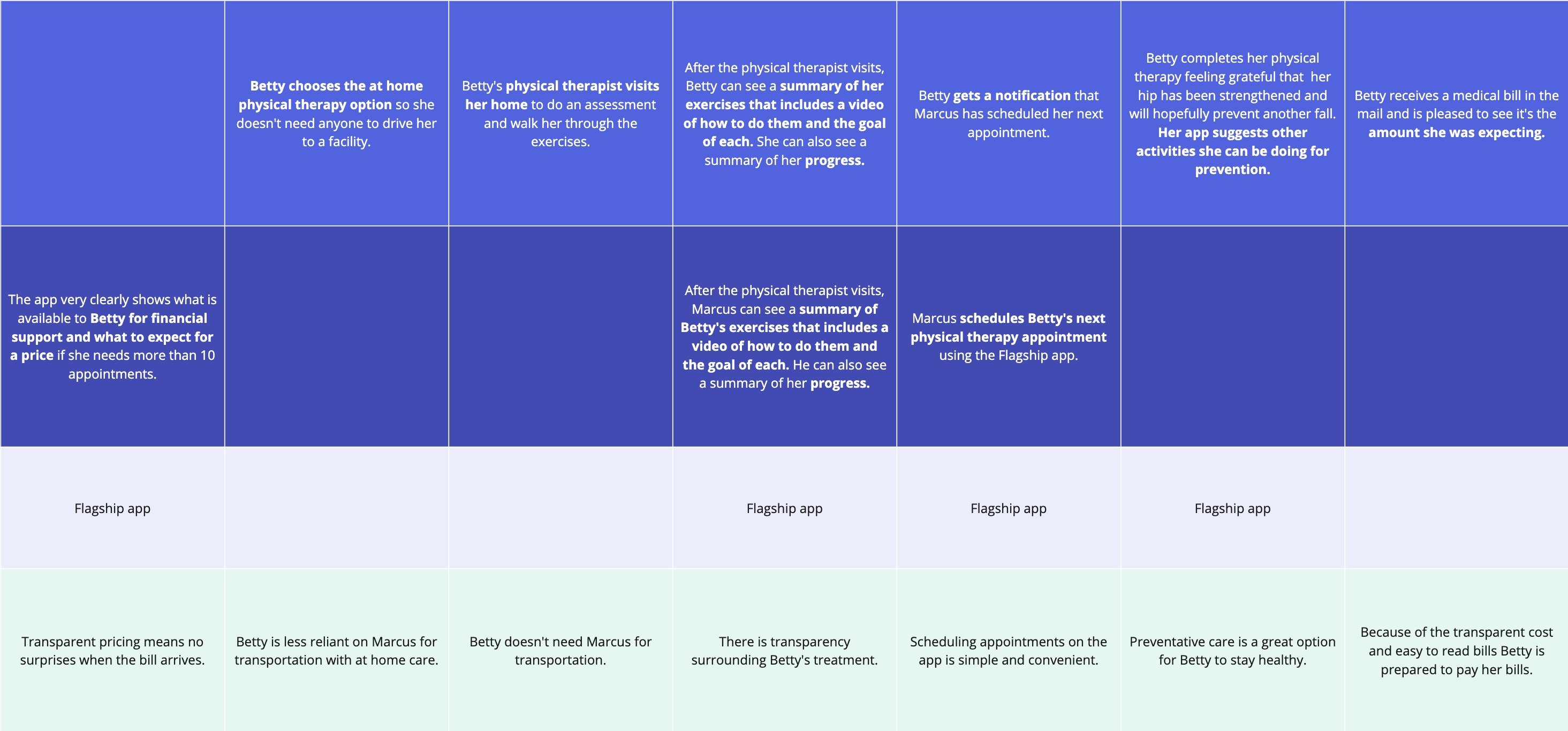
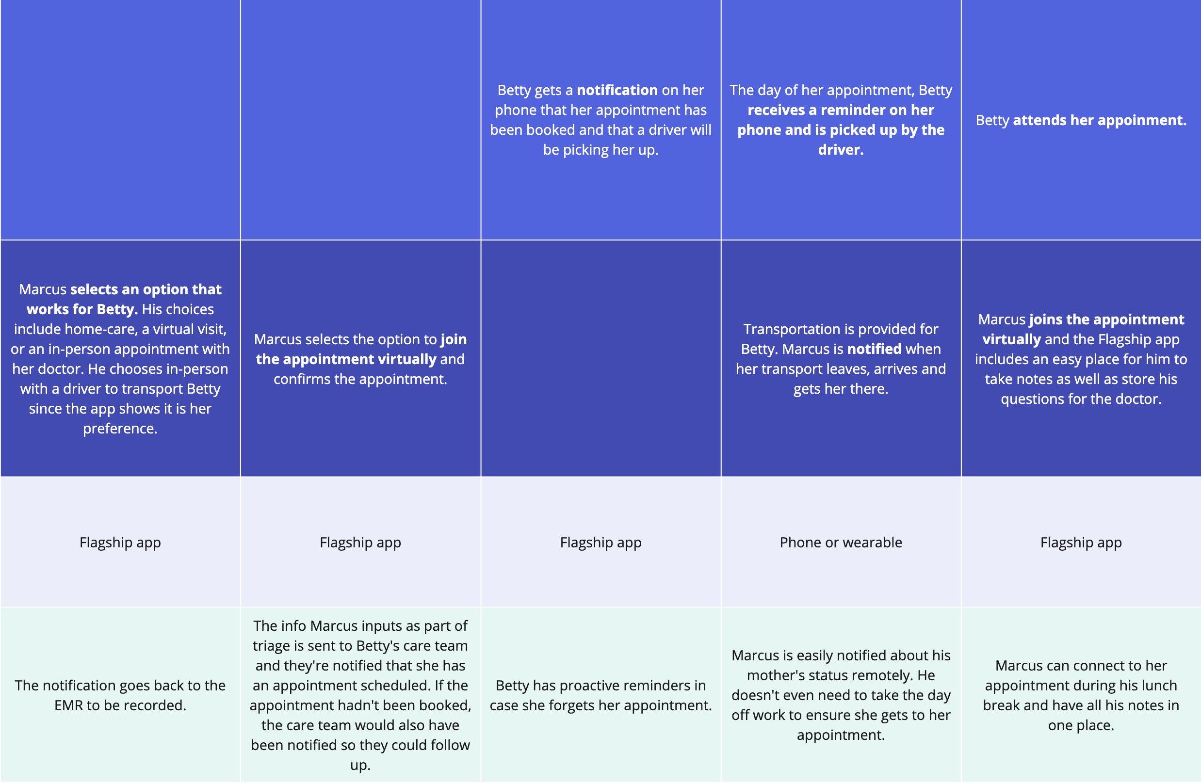
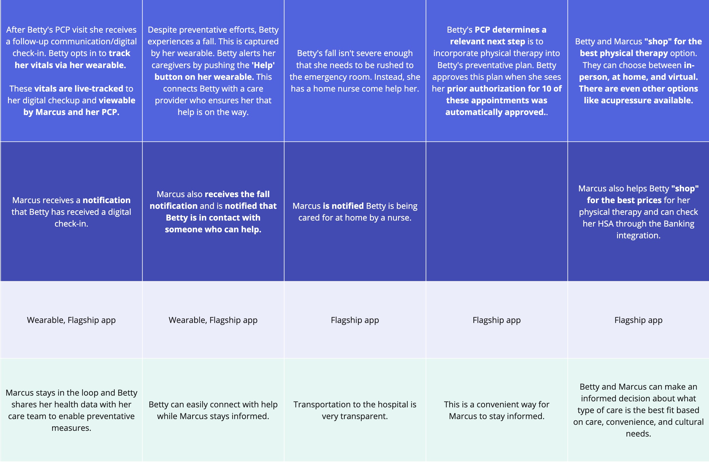
Future state journey map design (use arrows to navigate)
PROPOSED SOLUTION
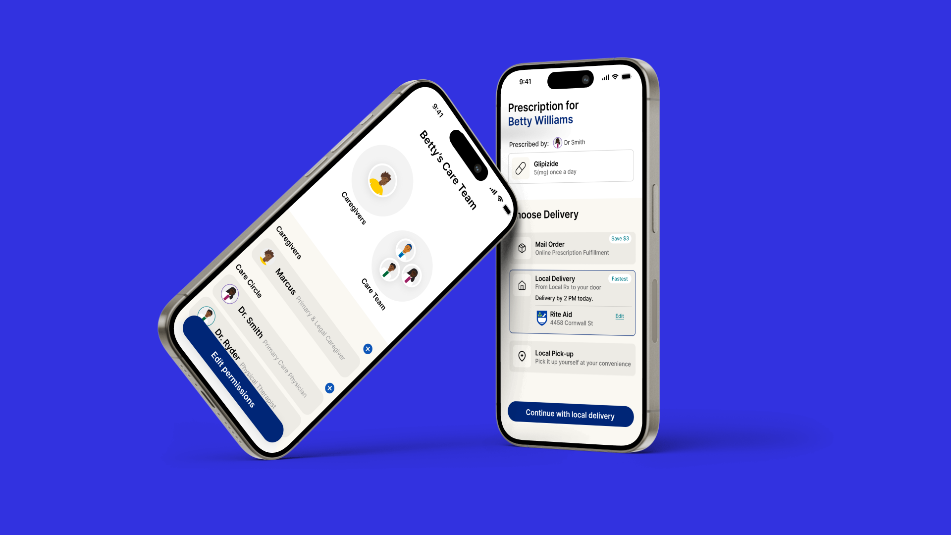
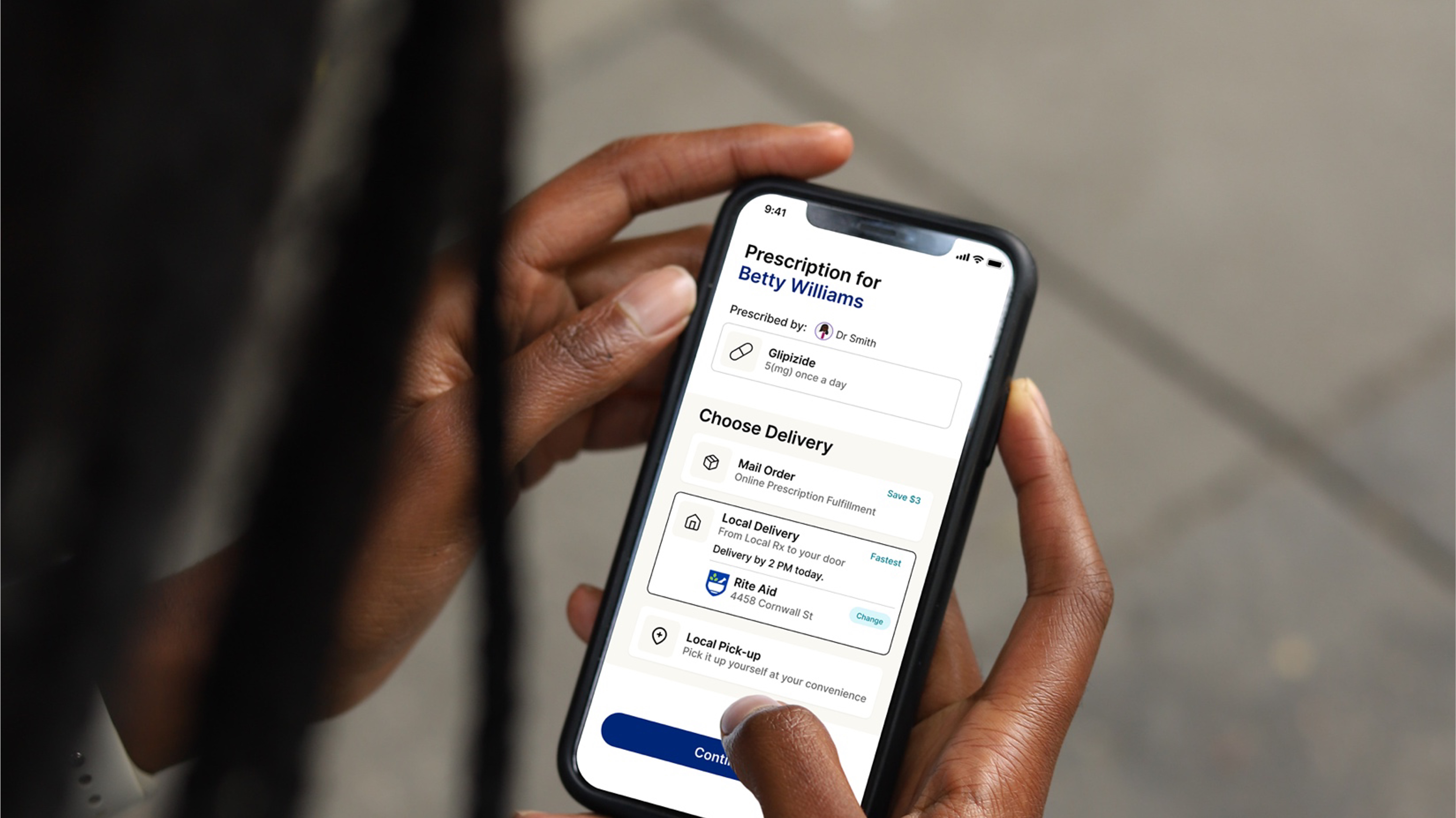
Conceptual App Designs
These screens were key for internal alignment and a
video showcasing the “art-of-the-possible” generated excitement for the
Flagship App across business units.
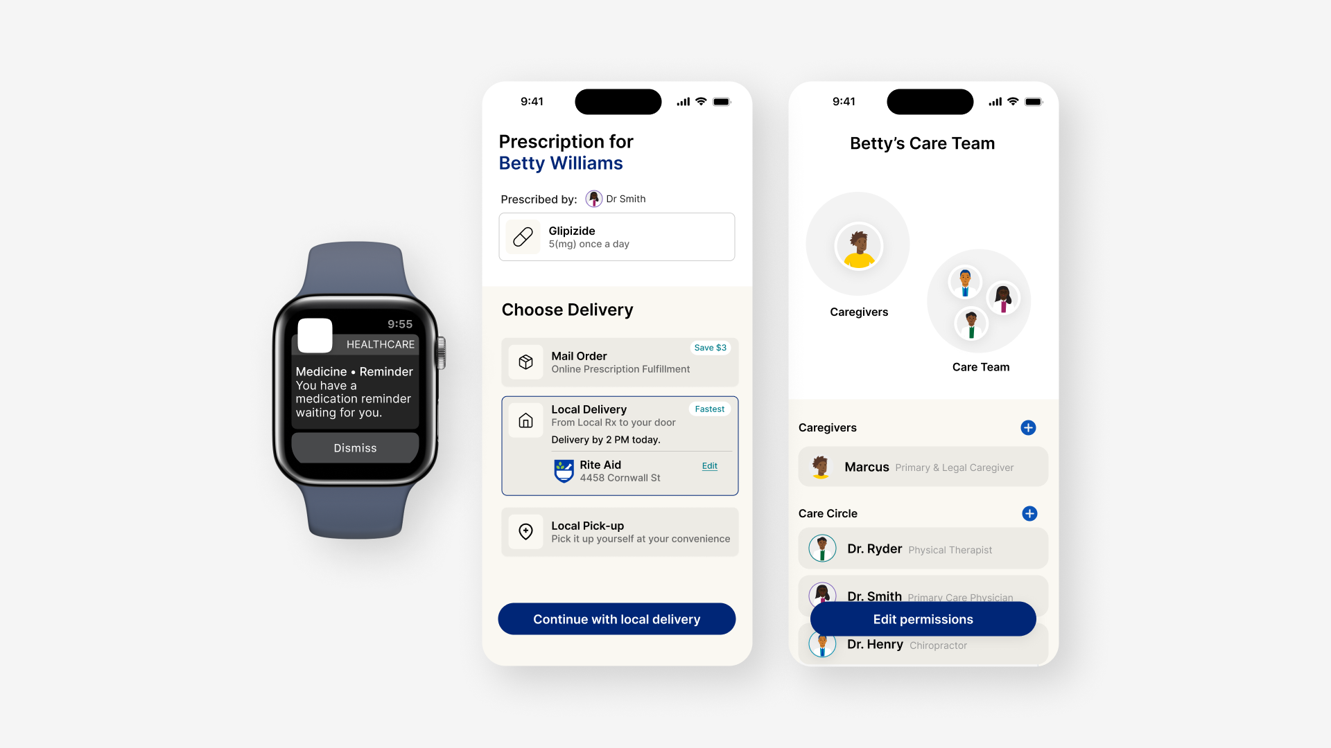
The conceptual screens included:
The conceptual screens included:
- Personalized features informed by the individual’s healthcare journey
- Preventative care measures
- Multiple platforms (mobile, web, wearables)
- Connected healthcare data


THE IMPACT
Oppurtunity For Improved Consumer Experience
When this alignment, the
Flagship App has the opportunity to improve the experiences of healthcare consumers including:
︎ Understand insurance benefits
︎ Proactively address health concerns
︎ Share information across the care team
︎ The overall navigation of the care experience